Perceção humana e cognição na visualização e leitura de dados
O que é a visualização de dados
A visualização dos dados tem o objetivo de exibir graficamente informação que é abstrata, que não descrever coisas físicas, mas que podem ser exibidas visualmente, como: estatísticas, dados de desempenho, informação de um cliente, etc., onde apresentação desta informação pode ter dois propósitos: Análise de dados e/ou Comunicação.
Para essa informação ser percetível pelo ser humano, têm que ser atribuídas propriedades para ser entendida pela visão, como: comprimento, posição, tamanho, forma, cor. Estes princípios do design quando atribuídos à informação, darão forma e massa tornando-a entendida pela visão, e então conseguirá ser compreendida pela pessoa.
Apresentação da informação
• Tabelas (leitura de dados) – Através de uma tabela podem ser apresentados valores ordenados e com precisão, tipicamente preenchida com texto ou números, e que através de um anterior processo cognitivo de padrões ou tendências, a pessoa mesmo não conhecendo os valores apresentados, consegue compreender a disposição dos elementos na tabela, e facilmente “ler” a tabela.
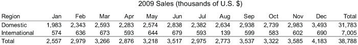
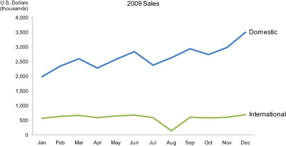
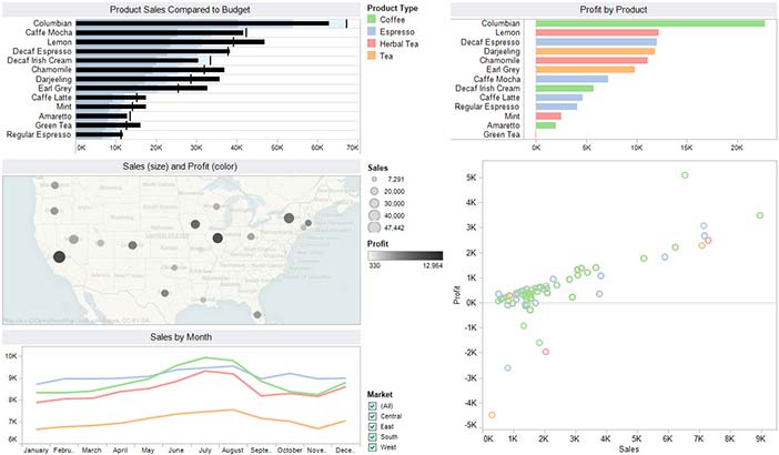
• Gráficos (visualização de dados) – A mesma informação da tabela anterior pode ser apresentada através de gráficos, fazendo uso de forma, cor, imagem, etc. Através de gráficos, a informação torna-se mais representativa sem necessidade da pessoa ter que ler individualmente cada valor apresentado, porque o cérebro faz um processamento visual, em vez de um processamento verbal, e lê o gráfico como um todo.
Através de um gráfico torna-se mais eficaz a perceção dos pontos mais altos ou baixos; tendências de crescimento, decrescimento ou estabilidade de diferentes elementos; comparação de várias entidades num determinado ponto ou intervalo, e relações entre os elementos.
Desenvolvimento das técnicas de visualização de dados no contexto histórico

|
René Descartes
Filósofo
31 março 1596 – 11 fevereiro 1650 (53 anos)
|
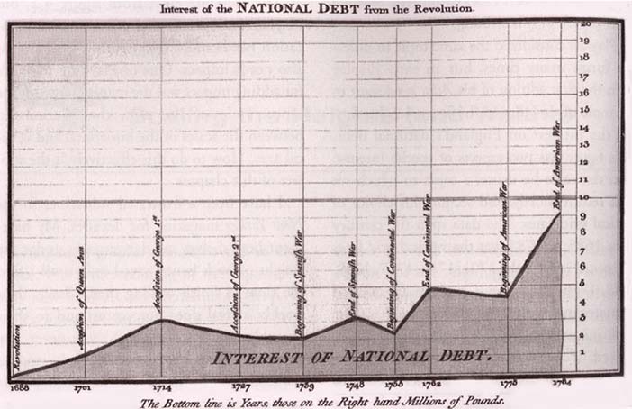
Desde o século II que as pessoas começaram a organizar a informação em linhas e colunas, mas a apresentação da informação quantitativa representada graficamente não surgiu até ao século XVII. Na época, esta inovação foi levada pelo filósofo e matemática francês, Rene Descartes (Réné Décart), que desenvolvei um sistema de coordenadas bidirecionais para exibir valores através de eixo vertical e eixo horizontal como meio gráfico para realizar operações matemáticas.

|
William Playfair
Engenheiro
15 maio 1790 – 19 março 1857 (66 anos)
|
Só no final do século XVIII (18) é que William Playfair começou a criar apresentações gráficas para fazer a representação os dados com o objetivo de comunicar informação quantitativa. Foi William Playfair que idealizou a representação de gráficos através de linhas com inclinações diferentes ao longo do eixo horizontal (da direita para a esquerda). Também inventou o gráfico de barras e o gráfico de tarte (pie chart) ou gráfico circular, que são gráficos que atualmente ainda utilizamos.
 |
Jacques Bertin
Cartógrafo
27 julho 1918 – 3 maio 2010 (97 anos)
|
Foi na segunda metade do século XX que Jacques Bertin (Jáque Bârrrtin) desenvolveu o trabalho que foi essencial para descobrir que a perceção visual opera segundo regras que podem ser seguidas para expressar informações visuais de maneiras representativas, intuitivas, claras, precisas e eficientes.
Em 1983, Edward Tufte, publicou o livro “The Visual Display of Quantitative Information”, que foi considerado inovador sobre a exibição visual da informação, onde desenvolveu melhores práticas para a visualização de dados que tornam mais eficiente essas práticas. Nessa mesma época, William Cleveland, também estendeu e refinou técnicas para a visualização dos dados.
Desde o século XXI que a visualização de dados é muito popular, e com o desenvolvimento dos computadores e software de representação de informação, torna-se fácil e acessível a todos, a criação desse tipo de elementos.
Perceção ou cognição na leitura da informação
A visualização dos dados só é bem-sucedida quando a informação é codificada de maneira que os olhos consigam ver e o cérebro consiga entender, onde o objetivo é traduzir informações abstratas em representações visuais que possam ser decodificadas facilmente e com precisão.
Para fazer representação de determinados dados, precisamos de entender os pontos fortes e fracos percetuais dos diferentes meios gráficos para exibir histórias específicas. Precisamos de entender perceção, porque para serem gráficos eficazes, têm que atingir corretamente objetivos a que se destinam.
Propriedades de exibição da informação em gráficos
Tabelas
• Indica claramente a relação entre valores;
• Representa as quantidades com precisão;
• Facilita a comparação de quantidades;
• Facilita a visualização da ordenação dos valores/quantidades.
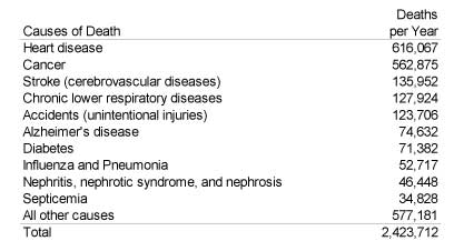
Gráfico de barras
• Indica claramente a natureza do relacionamento;
• Representa as quantidades com precisão;
• Facilita a comparação de quantidades;
• Torna mais fácil ver a ordem de classificação dos valores;
• Torna óbvio como as pessoas devem usar as informações.
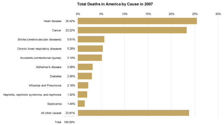
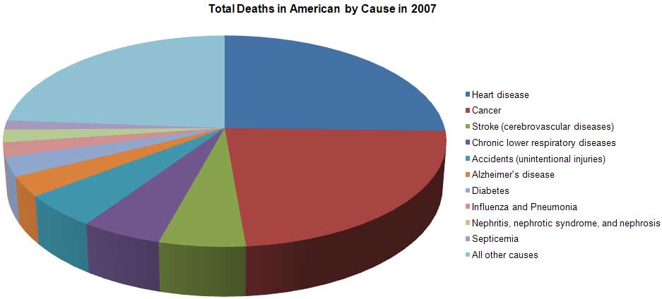
Gráfico de tarte
• Indica claramente a natureza do relacionamento;
• Não representa as quantidades com precisão;
• Não torna fácil comparar as quantidades dos valores;
• Não torna completamente óbvio como as pessoas devem usar a informação.
Perceção Humana e Cognição Humana
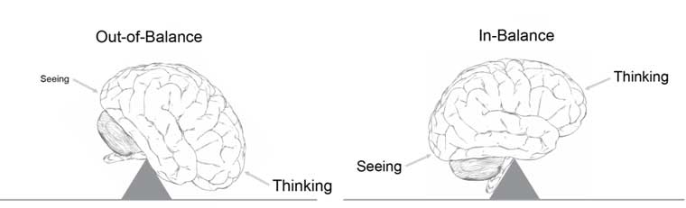
A visualização de dados é mais eficaz porque tira proveito das habilidades do cérebro através da visão (perceção) porque é extremamente rápida e eficiente, a visão é tratada pelo córtex que fica na parte posterior do cérebro, ao contrário da cognição (pensamento) que é mais lento e menos eficiente.
A visualização de dados consiste em vários estágios pelo cérebro, cada um manipulado por neurónios especializados que são afinados para detetar atributos particulares da informação visual contida na luz que reflete nas superfícies dos objetos, que depois é construída a imagem do objeto na nossa mente. Nós usamos atributos básicos como: diferença de tamanho, tonalidade, intensidade de cor, ângulo, textura, forma, etc., como blocos de construção da visualização de dados. Quando fazemos isso de uma maneira informada, como a utilização de um gráfico, temos a capacidade de transferir grande parte do trabalho necessário para descodificar os elementos visuais, da parte mais lenta do cérebro para o córtex mais rápido, e assim resulta numa cognição mais eficiente.
Estudos de perceção da leitura de informação
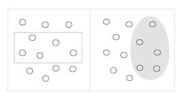
A escola de Escola Gestalt de Psicologia foi uma das primeiras escolas a dar a sua contribuição para a ciência da perceção. A sua investigação na área começou em 1912 com o objetivo de descobrir como o nosso cérebro percebe os padrões, formas e organiza a informação que vemos. Os fundadores observaram que as pessoas organizam o que veem de maneira a que a informação faça sentido. Do resultado do estudo proveio uma série de princípios, chamados “Princípios de Gestalt”, esses princípios servem para criar bons conteúdos visuais, em que ainda hoje são respeitados como descrições precisas do comportamento visual.
Alguns dos Princípios de Gestalt:
Proximidade Objetos que estão próximos são percebidos como um grupo. |
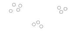
|
Semelhança Objetos que estão próximos são percebidos como um grupo. |
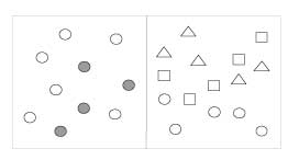
|
Invólucro Objetos que compartilham atributos semelhantes são percebidos como um grupo (ex: cor ou forma). |
|
Fecho Objetos que parecem ter um limite ao redor deles são percebidos como um grupo. |
|
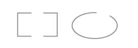
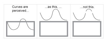
Continuidade Estruturas abertas são percebidas como fechadas, completas e regulares quando são interpretadas como elementos que reconhecemos. |
|
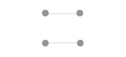
Conexão Objetos que estão alinhados juntos ou parecem ser uma continuação um do outro são percebidos como um grupo. |
 |
Novos estudos sobre perceção e cognição estão a ser feitos através de várias disciplinas em relação a “fatores humanos” e “relação humano-computador”, mas a mais inovadora surge das Ciências cognitivas, em especial da Psicologia cognitiva, atualmente com apoio das novas tecnologias e metodologias para a exploração do cérebro. Com o apoio da tecnologia, são geradas quantidades enormes de informação produzidas pelo cérebro, e o processamento e exploração dessa informação gerada, cria oportunidades para melhorar a eficácia do estudo percetual da visualização através dos dados gerados pelo ser humano.
Estudos em atenção e memória estão a revelar a nossa capacidade limitada de guardar simultaneamente vários itens de informação na consciência. Um método para aumentarmos essa capacidade de armazenamento é codificando visualmente as informações, o que permite guardar mais informações nos espaços de memória disponíveis do cérebro.
Outro método é colocar várias visões de informação ao mesmo tempo diante de nossos olhos, de forma a podermos visualizar a informação de múltiplas perspetivas para fazer comparações e ver ligações entre a informação até um nível que fosse impossível “consumirmos” a informação uma de cada vez, devido às limitações da memória. Boas técnicas de visualização de dados juntamente com as tecnologias, podem ajudar a estender o nosso pensamento analítico ao darmos sentido à informação.
O futuro da investigação
O que é mais necessário no campo da visualização de dados, pode não ser o que é mais empolgante ou nem inovador. Às vezes apenas necessitamos de fazer com que as coisas se tornem mais fáceis de perceber, usar e visualizar.
Um exemplo disso, são os criadores de software, que criam boas práticas de visualização no desenvolvimento das suas aplicações, seja no esquema da aplicação, menus ou ferramentas que o utilizador tem que usar. Através de padrões, torna assim mais fácil e menos demorado fazer o que funciona, e mais difícil e mais caro faça o que não faz.
Portanto, a direção de futuro desenvolvimento na área de visualização de informação, não necessita de ter que inovar ou criar novas maneiras de fazer as coisas, mas melhorar e simplificar a maneira como se faz hoje.
Fonte: https://www.interaction-design.org/literature/book/the-encyclopedia-of-human-computer-interaction-2nd-ed/data-visualization-for-human-perception
______________________________________________________________________
Index
― Perceção humana e cognição na visualização e leitura de dados (PORTUGUESE | PORTUGUÊS)
― Perception and human cognition in reading and visualization of data (ENGLISH)
― Perception et cognition humaine en lecture et visualisation de données (FRENCH | FRANÇAIS)
― Percepción y cognición humana en lectura y visualización de datos (SPANISH | ESPAÑOL)
― Wahrnehmung und menschliche Wahrnehmung beim Lesen und Visualisieren von Daten (GERMAN | DEUTSCHE)
― Percezione e cognizione umana nella lettura e visualizzazione dei dati (ITALIAN | ITALIANO)
― 阅读和数据可视化中的感知和人类认知 (CHINESE | 中文)
― Восприятие и человеческое познание при чтении и визуализации данных (RUSSIAN | РУССКИЙ)
― Verilerin okunması ve görselleştirilmesinde algı ve insan bilişi (TURKISH | TÜRK)
― Сприйняття та пізнання людини при читанні та візуалізації даних (UKRAINIAN | УКРАЇНСЬКИЙ)
______________________________________________________________________
ENGLISH
Human perception and cognition in reading and visualization of data
What is Data Visualization
Data visualization is intended to graphically display information that is abstract, not describing physical things, but which can be displayed visually, such as: statistics, performance data, customer information, etc. where presentation of this information may have two purposes: Data analysis and / or Communication.
For this information to be perceived by the human being, properties have to be assigned to be understood by vision, such as: length, position, size, shape, color. These principles of design when attributed to information will give form and mass making it understood by vision, and then will be understood by the person.
Presentation of information
• Tables (reading of data) - Through a table can be presented ordered and accurate values, typically filled with text or numbers, and that through an earlier cognitive process of patterns or trends, the person does not know the values presented, can understand the layout of the elements in the table, and easily "read" the table.
[img] https://bit.ly/2Qrc3su
• Graphs (data visualization) - The same information in the previous table can be presented through graphs, making use of shape, color, image, etc. Through graphics, the information becomes more representative without the need for the individual having to read each value presented, because the brain does a visual processing, rather than a verbal processing, and reads the graph as a whole.
[img] https://bit.ly/2KNR7GE [img] https://bit.ly/2KMS5TA
Through a graph it becomes more effective to perceive the highest or lowest points; trends of growth, decay or stability of different elements; comparison of several entities at a given point or interval, and relationships between the elements.
Development of data visualization techniques in the historical context
René Descartes, Philosopher, 31 March 1596 - 11 February 1650 (53 years old)
Since the second century people began to organize information in rows and columns, but the presentation of graphically represented quantitative information did not arise until the seventeenth century. At the time, this innovation was led by the French philosopher and mathematician, Rene Descartes (Réné Décart), who developed a system of bidirectional coordinates to display values through the vertical axis and horizontal axis as a graphic medium to perform mathematical operations.
[img] https://bit.ly/2RmvxeR
William Playfair, Engineer, 15 May 1790 - 19 March 1857 (66 years old)
It was only at the end of the 18th century that William Playfair began to create graphical presentations to represent the data in order to communicate quantitative information. It was William Playfair who idealized the representation of graphs across lines with different slopes along the horizontal axis (from right to left). He also invented the pie chart and pie chart, which are charts that we still use today.
Jacques Bertin, Cartographer, July 27, 1918 - May 3, 2010 (97 years old)
It was in the second half of the 20th century, Jacques Bertin developed the work that was essential to discover that visual perception operates according to rules that can be followed to express visual information in representative, intuitive, clear, precise and efficient.
In 1983, Edward Tufte published the book "The Visual Display of Quantitative Information", which was considered to be an innovator in the visual display of information, where he developed best practices for visualizing data that make these practices more efficient. At the same time, William Cleveland also extended and refined techniques for visualizing the data.
Since the twenty-first century that data visualization is very popular, and with the development of computers and information representation software, it becomes easy and accessible to all, the creation of such elements.
[img] https://bit.ly/2E9MlmL
Perception or cognition in reading information
Visualization of data is successful only when the information is coded so that the eyes can see and the brain can understand, where the purpose is to translate abstract information into visual representations that can be decoded easily and accurately.
To represent certain data, we need to understand the strengths and weaknesses of different graphical media to display specific stories. We need to understand perception, because in order to be effective graphics, they have to correctly achieve their intended goals.
Display properties of information in charts
Tables
• Clearly indicates the relationship between values;
• Represents quantities accurately;
• Facilitates comparison of quantities;
• Facilitates the visualization of ordering of values / quantities.
[img] https://bit.ly/2QwkR06
Bar chart
• Clearly indicates the nature of the relationship;
• Represents quantities accurately;
• Facilitates comparison of quantities;
• It makes it easier to see the sort order of values;
• Make it obvious how people should use the information.
[img] https://bit.ly/2Rouuv2
Pie chart
• Clearly indicates the nature of the relationship;
• Does not accurately represent quantities;
• It does not make it easy to compare amounts of values;
• It does not make it completely obvious how people should use information.
[img] https://bit.ly/2Q3WVln
Human Perception and Human Cognition
Data visualization is most effective because it takes advantage of the brain's abilities through vision (perception) because it is extremely fast and efficient, the vision is treated by the cortex in the back of the brain, unlike the cognition (thought) that is slower and less efficient.
The data visualization consists of several stages through the brain, each manipulated by specialized neurons that are tuned to detect particular attributes of the visual information contained in the light that reflects on the surfaces of objects, which is then constructed the image of the object in our mind. We use basic attributes such as: size difference, hue, color intensity, angle, texture, shape, etc., as building blocks of data visualization. When we do this in an informed way, such as using a graph, we have the ability to transfer much of the work needed to decode the visual elements from the slowest part of the brain to the faster cortex and thus results in more efficient cognition .
[img] https://bit.ly/2BIJE98
Perception studies of reading information
The Gestalt School of Psychology school was one of the first schools to make its contribution to the science of perception. His research in the area began in 1912 with the goal of discovering how our brain perceives the patterns, shapes and organizes the information we see. The founders noted that people organize what they see in a way that makes sense. From the result of the study came a series of principles, called "Gestalt Principles", these principles serve to create good visual contents, in which even today they are respected as accurate descriptions of the visual behavior.
Studies of perception of reading information
The Gestalt School of Psychology school was one of the first schools to make its contribution to the science of perception. His research in the area began in 1912 with the goal of discovering how our brain perceives the patterns, shapes and organizes the information we see. The founders noted that people organize what they see in a way that makes sense. From the result of the study came a series of principles, called "Gestalt Principles", these principles serve to create good visual contents, in which even today they are respected as accurate descriptions of the visual behavior.
Some of the Gestalt Principles:
Proximity – Objects that are close are perceived as a group. [img] https://bit.ly/2Q7wRGa
Resemblance – Objects that are close are perceived as a group. [img] https://bit.ly/2rdgWXI
Enclosure – Objects that share similar attributes are perceived as a group. [img] https://bit.ly/2KLqGlb
Closure – Objects that seem to have a border around them are perceived as a group. [img] https://bit.ly/2SltnfK
Continuity – Open structures are perceived as closed, complete and regular when they are interpreted as elements that we recognize. [img] https://bit.ly/2rhauiK
Connection – Objects that are aligned together or appear to be a continuation of each other are perceived as a group. [img] https://bit.ly/2FOLbyx
New studies on perception and cognition are being made through various disciplines in relation to "human factors" and "human-computer relationship", but the most innovative one comes from cognitive sciences, especially cognitive psychology, currently supported by new technologies and methodologies for brain exploration. With the support of technology, enormous amounts of information produced by the brain are generated, and the processing and exploitation of this generated information creates opportunities to improve the effectiveness of the percetual study of visualization through the data generated by the human being.
Attention and memory studies are revealing our limited ability to simultaneously store various items of information in consciousness. One method to increase this storage capacity is to visually encode information, allowing you to store more information in the available memory spaces of the brain.
Another method is to put multiple views of information at the same time before our eyes, so that we can visualize information from multiple perspectives to make comparisons and see links between information to a level that it is impossible to "consume" the information one at a time , due to memory limitations. Good data visualization techniques coupled with technologies can help extend our analytical thinking by making sense of information.
The future of research
What is most needed in the field of data visualization may not be the most exciting or innovative. Sometimes we just need to make things easier to perceive, use and visualize.
An example of this is software developers, who create good visualization practices in the development of their applications, either in the application schema, menus or tools that the user has to use. By standards, it makes it easier and less time consuming to do what works, and harder and more expensive do what you do not.
Therefore, the direction of future development in the area of information visualization does not need to have to innovate or create new ways of doing things, but to improve and simplify the way it is done today.
______________________________________________________________________
FRENCH | FRANÇAIS
Perception et cognition humaine en lecture et visualisation de données
Qu'est-ce que la visualisation de données?
La visualisation de données est destinée à afficher graphiquement des informations abstraites, ne décrivant pas des choses physiques, mais pouvant être affichées de manière visuelle, telles que: statistiques, données de performance, informations client, etc. lorsque la présentation de cette information peut avoir deux objectifs: l'analyse des données et / ou communication.
Pour que cette information soit perçue par l'être humain, il est nécessaire d'attribuer les propriétés à comprendre par la vision, telles que: longueur, position, taille, forme, couleur. Ces principes de conception, une fois attribués à l’information, donneront forme et masse, ce qui la rendra compréhensible par vision, puis sera comprise par la personne.
Présentation de l'information
• Tableaux (lecture des données) - Un tableau permet de présenter des valeurs ordonnées et précises, généralement remplies de texte ou de chiffres, et grâce à un processus cognitif antérieur de modèles ou de tendances, la personne ne connaît pas les valeurs présentées et peut comprendre les éléments suivants: mise en page des éléments dans la table, et facilement "lire" la table.
[img] https://bit.ly/2Qrc3su
• Graphiques (visualisation de données) - Les mêmes informations du tableau précédent peuvent être présentées sous forme de graphiques, utilisant la forme, la couleur, l'image, etc. Grâce aux graphiques, les informations deviennent plus représentatives sans que l'individu ait à lire chaque valeur. présenté, parce que le cerveau effectue un traitement visuel plutôt que verbal, et lit le graphique dans son ensemble.
[img] https://bit.ly/2KNR7GE [img] https://bit.ly/2KMS5TA
À travers un graphique, il devient plus efficace de percevoir les points les plus hauts ou les plus bas; les tendances de croissance, de dégradation ou de stabilité de différents éléments; comparaison de plusieurs entités en un point ou un intervalle donné et relations entre les éléments.
Développement de techniques de visualisation de données dans le contexte historique
René Descartes, philosophe, 31 mars 1596 - 11 février 1650 (53 ans)
Depuis le deuxième siècle, les gens ont commencé à organiser les informations en lignes et en colonnes, mais la présentation d’informations quantitatives représentées graphiquement n’est apparue qu’au XVIIe siècle. À l’époque, cette innovation était dirigée par le philosophe et mathématicien français René Descartes (René Décart), qui a mis au point un système de coordonnées bidirectionnelles permettant d’afficher les valeurs sur les axes vertical et horizontal en tant que moyen graphique permettant de réaliser des opérations mathématiques.
[img] https://bit.ly/2RmvxeR
William Playfair, ingénieur, 15 mai 1790 - 19 mars 1857 (66 ans)
Ce n’est qu’à la fin du XVIIIe siècle que William Playfair a commencé à créer des présentations graphiques représentant les données afin de communiquer des informations quantitatives. C'est William Playfair qui a idéalisé la représentation des graphiques sur des lignes présentant des pentes différentes le long de l'axe horizontal (de droite à gauche). Il a également inventé le camembert et le camembert, des graphiques que nous utilisons encore aujourd'hui.
Jacques Bertin, cartographe, 27 juillet 1918 - 3 mai 2010 (97 ans)
C'est dans la seconde moitié du XXe siècle que Jacques Bertin a développé le travail essentiel pour découvrir que la perception visuelle fonctionnait selon des règles pouvant être suivies pour exprimer des informations visuelles représentatives, intuitives, claires, précises et efficaces.
En 1983, Edward Tufte a publié le livre "L'affichage visuel d'informations quantitatives", considéré comme un innovateur dans l'affichage visuel d'informations. Il y a développé les meilleures pratiques pour visualiser les données qui rendent ces pratiques plus efficaces. En même temps, William Cleveland a également étendu et perfectionné les techniques de visualisation des données.
Depuis le XXIe siècle, la visualisation de données est très populaire et, avec le développement des ordinateurs et des logiciels de représentation de l'information, il devient facile et accessible à tous de créer de tels éléments.
[img] https://bit.ly/2E9MlmL
Perception ou cognition dans la lecture d'informations
La visualisation des données ne réussit que lorsque les informations sont codées de sorte que les yeux puissent voir et que le cerveau puisse comprendre, le but étant de traduire des informations abstraites en représentations visuelles pouvant être décodées facilement et avec précision.
Pour représenter certaines données, nous devons comprendre les forces et les faiblesses de différents supports graphiques pour pouvoir afficher des articles spécifiques. Nous devons comprendre la perception, car pour être efficaces, les graphiques doivent atteindre correctement les objectifs visés.
Afficher les propriétés des informations dans les graphiques
les tables
• indique clairement la relation entre les valeurs;
• représente les quantités avec précision;
• facilite la comparaison des quantités;
• Facilite la visualisation de la commande de valeurs / quantités.
[img] https://bit.ly/2QwkR06
Diagramme à bandes
• indique clairement la nature de la relation;
• représente les quantités avec précision;
• facilite la comparaison des quantités;
• Il est plus facile de voir l'ordre de tri des valeurs.
• Expliquez clairement aux utilisateurs comment utiliser ces informations.
[img] https://bit.ly/2Rouuv2
Camembert
• indique clairement la nature de la relation;
• ne représente pas les quantités avec précision;
• Il n'est pas facile de comparer des quantités de valeurs.
• Cela ne rend pas complètement évident comment les gens devraient utiliser l'information.
[img] https://bit.ly/2Q3WVln
Perception humaine et cognition humaine
La visualisation des données est plus efficace car elle exploite les capacités du cerveau par la vision (perception) car elle est extrêmement rapide et efficace, la vision est traitée par le cortex situé à l'arrière du cerveau, contrairement à la cognition (pensée) qui est plus lente et plus lente. moins efficace.
La visualisation des données comprend plusieurs étapes dans le cerveau, chacune étant manipulée par des neurones spécialisés accordés pour détecter des attributs particuliers de l'information visuelle contenue dans la lumière réfléchie à la surface des objets, laquelle est ensuite construite à partir de l'image de cet objet. esprit. Nous utilisons des attributs de base tels que: différence de taille, teinte, intensité de couleur, angle, texture, forme, etc., comme éléments de base de la visualisation des données. Lorsque nous procédons de manière informée, par exemple en utilisant un graphique, nous sommes en mesure de transférer une grande partie du travail nécessaire pour décoder les éléments visuels de la partie la plus lente du cerveau vers le cortex plus rapide, ce qui permet une cognition plus efficace.
[img] https://bit.ly/2BIJE98
Etudes de perception de l'information en lecture
La Gestalt School of Psychology a été l’une des premières écoles à apporter sa contribution à la science de la perception. Ses recherches dans la région ont commencé en 1912 dans le but de découvrir comment notre cerveau perçoit les schémas, façonne et organise les informations que nous voyons. Les fondateurs ont noté que les gens organisent ce qu'ils voient d'une manière qui a du sens. Les résultats de l'étude ont donné lieu à une série de principes, appelés "principes de Gestalt", qui servent à créer de bons contenus visuels, dans lesquels, même aujourd'hui, ils sont respectés en tant que descriptions précises du comportement visuel.
Etudes de perception d'informations de lecture
La Gestalt School of Psychology a été l’une des premières écoles à apporter sa contribution à la science de la perception. Ses recherches dans la région ont commencé en 1912 dans le but de découvrir comment notre cerveau perçoit les schémas, façonne et organise les informations que nous voyons. Les fondateurs ont noté que les gens organisent ce qu'ils voient d'une manière qui a du sens. Les résultats de l'étude ont donné lieu à une série de principes, appelés "principes de Gestalt", qui servent à créer de bons contenus visuels, dans lesquels, même aujourd'hui, ils sont respectés en tant que descriptions précises du comportement visuel.
Quelques principes de la Gestalt:
Proximité - Les objets proches sont perçus comme un groupe. [img] https://bit.ly/2Q7wRGa
Ressemblance - Les objets proches sont perçus comme un groupe. [img] https://bit.ly/2rdgWXI
Enceinte - Les objets qui partagent des attributs similaires sont perçus comme un groupe. [img] https://bit.ly/2KLqGlb
Fermeture - Les objets qui semblent entourés d’une bordure sont perçus comme un groupe. [img] https://bit.ly/2SltnfK
Continuité - Les structures ouvertes sont perçues comme fermées, complètes et régulières lorsqu'elles sont interprétées comme des éléments que nous reconnaissons. [img] https://bit.ly/2rhauiK
Connexion - Les objets qui sont alignés ou qui semblent se prolonger sont perçus comme un groupe. [img] https://bit.ly/2FOLbyx
De nouvelles études sur la perception et la cognition sont menées dans diverses disciplines en relation avec les "facteurs humains" et la "relation homme-ordinateur", mais la plus innovante provient des sciences cognitives, en particulier de la psychologie cognitive, actuellement soutenues par de nouvelles technologies et méthodologies pour le cerveau. exploration. Avec le soutien de la technologie, d’énormes quantités d’informations produites par le cerveau sont générées. Le traitement et l’exploitation de ces informations générées offrent la possibilité d’améliorer l’efficacité de l’étude percétuelle de la visualisation grâce aux données générées par l’être humain.
Des études sur l’attention et la mémoire révèlent notre capacité limitée à stocker simultanément divers éléments d’information dans la conscience. Une méthode pour augmenter cette capacité de stockage consiste à coder visuellement des informations, ce qui vous permet de stocker davantage d'informations dans les espaces mémoire disponibles du cerveau.
Une autre méthode consiste à afficher simultanément sous nos yeux plusieurs vues d’informations, afin que nous puissions visualiser les informations de plusieurs points de vue et faire des comparaisons et voir les liens entre les informations à un niveau tel qu’il est impossible de "consommer" les informations une par une. temps, en raison de limitations de la mémoire. De bonnes techniques de visualisation des données, associées aux technologies, peuvent aider à étendre notre pensée analytique en donnant un sens à l’information.
L'avenir de la recherche
Ce qui est le plus nécessaire dans le domaine de la visualisation de données peut ne pas être le plus excitant ou le plus innovant. Parfois, nous devons simplement rendre les choses plus faciles à percevoir, utiliser et visualiser.
Les développeurs de logiciels, par exemple, créent de bonnes pratiques de visualisation dans le développement de leurs applications, que ce soit dans le schéma d'application, les menus ou les outils que l'utilisateur doit utiliser. Selon les normes, il est plus facile et plus rapide de faire ce qui fonctionne, et plus difficile et plus coûteux de faire ce que vous ne faites pas.
Par conséquent, l'orientation du développement futur dans le domaine de la visualisation de l'information n'a pas besoin d'innover ou de créer de nouvelles façons de faire, mais d'améliorer et de simplifier la façon dont cela se fait aujourd'hui.
______________________________________________________________________
SPANISH | ESPAÑOL
Percepción y cognición humana en lectura y visualización de datos
¿Qué es la visualización de datos?
La visualización de datos está diseñada para mostrar gráficamente información que es abstracta, no describe cosas físicas, pero que puede mostrarse visualmente, como: estadísticas, datos de rendimiento, información del cliente, etc. donde la presentación de esta información puede tener dos propósitos: análisis de datos y / o la comunicación.
Para que esta información sea percibida por el ser humano, las propiedades deben asignarse para ser entendidas por visión, tales como: longitud, posición, tamaño, forma, color. Estos principios de diseño cuando se atribuyen a la información darán forma y masa para que se entiendan por visión, y luego serán comprendidos por la persona.
Presentación de la información
• Tablas (lectura de datos): a través de una tabla se pueden presentar valores ordenados y precisos, generalmente rellenos con texto o números, y que a través de un proceso cognitivo anterior de patrones o tendencias, la persona no conoce los valores presentados, puede entender el El diseño de los elementos en la tabla, y fácilmente "leer" la tabla.
[img] https://bit.ly/2Qrc3su
• Gráficos (visualización de datos): la misma información en la tabla anterior se puede presentar a través de gráficos, haciendo uso de la forma, color, imagen, etc. A través de gráficos, la información se vuelve más representativa sin la necesidad de que el individuo tenga que leer cada valor presentado, porque el cerebro realiza un procesamiento visual, en lugar de un procesamiento verbal, y lee la gráfica como un todo.
[img] https://bit.ly/2KNR7GE [img] https://bit.ly/2KMS5TA
A través de una gráfica se vuelve más efectivo percibir los puntos más altos o más bajos; tendencias de crecimiento, decaimiento o estabilidad de diferentes elementos; comparación de varias entidades en un punto o intervalo dado, y relaciones entre los elementos.
Desarrollo de técnicas de visualización de datos en el contexto histórico.
René Descartes, filósofo, 31 de marzo de 1596 - 11 de febrero de 1650 (53 años)
Desde el siglo II, la gente comenzó a organizar la información en filas y columnas, pero la presentación de información cuantitativa representada gráficamente no surgió hasta el siglo XVII. En ese momento, esta innovación fue liderada por el filósofo y matemático francés, René Descartes (Réné Décart), quien desarrolló un sistema de coordenadas bidireccionales para mostrar valores a través del eje vertical y horizontal como un medio gráfico para realizar operaciones matemáticas.
[img] https://bit.ly/2RmvxeR
William Playfair, ingeniero, 15 de mayo de 1790 - 19 de marzo de 1857 (66 años)
Fue solo a fines del siglo XVIII cuando William Playfair comenzó a crear presentaciones gráficas para representar los datos con el fin de comunicar información cuantitativa. Fue William Playfair quien idealizó la representación de gráficos en líneas con diferentes pendientes a lo largo del eje horizontal (de derecha a izquierda). También inventó el gráfico circular y el gráfico circular, que son los gráficos que todavía utilizamos en la actualidad.
Jacques Bertin, cartógrafo, 27 de julio de 1918 - 3 de mayo de 2010 (97 años)
En la segunda mitad del siglo XX, Jacques Bertin desarrolló el trabajo que fue esencial para descubrir que la percepción visual funciona de acuerdo con las reglas que se pueden seguir para expresar información visual de manera representativa, intuitiva, clara, precisa y eficiente.
En 1983, Edward Tufte publicó el libro "La visualización visual de la información cuantitativa", que se consideró un innovador en la visualización visual de la información, donde desarrolló las mejores prácticas para visualizar datos que hacen que estas prácticas sean más eficientes. Al mismo tiempo, William Cleveland también extendió y refinó las técnicas para visualizar los datos.
Desde el siglo XXI, la visualización de datos es muy popular, y con el desarrollo de computadoras y software de representación de información, se vuelve fácil y accesible para todos, la creación de dichos elementos.
[img] https://bit.ly/2E9MlmL
Percepción o cognición en la información de lectura.
La visualización de los datos es exitosa solo cuando la información está codificada para que los ojos puedan ver y el cerebro pueda entender, donde el propósito es traducir la información abstracta en representaciones visuales que se pueden descodificar con facilidad y precisión.
Para representar ciertos datos, necesitamos comprender las fortalezas y debilidades de diferentes medios gráficos para mostrar historias específicas. Necesitamos entender la percepción, porque para ser gráficos efectivos, tienen que alcanzar correctamente los objetivos previstos.
Mostrar propiedades de información en gráficos
Mesas
• Indica claramente la relación entre los valores;
• Representa cantidades con precisión;
• Facilita la comparación de cantidades;
• Facilita la visualización de ordenación de valores / cantidades.
[img] https://bit.ly/2QwkR06
Gráfico de barras
• Indica claramente la naturaleza de la relación;
• Representa cantidades con precisión;
• Facilita la comparación de cantidades;
• Hace que sea más fácil ver el orden de los valores;
• Hacer obvio cómo las personas deben usar la información.
[img] https://bit.ly/2Rouuv2
Gráfico circular
• Indica claramente la naturaleza de la relación;
• No representa con precisión las cantidades;
• No facilita la comparación de cantidades de valores;
• No hace que sea completamente obvio cómo las personas deben usar la información.
[img] https://bit.ly/2Q3WVln
Percepción humana y cognición humana
La visualización de datos es más efectiva porque aprovecha las capacidades del cerebro a través de la visión (percepción) porque es extremadamente rápida y eficiente, la visión es tratada por la corteza en la parte posterior del cerebro, a diferencia de la cognición (pensamiento) que es más lenta y eficiente. menos eficiente.
La visualización de los datos consta de varias etapas a través del cerebro, cada una de ellas manipulada por neuronas especializadas que se sintonizan para detectar atributos particulares de la información visual contenida en la luz que se refleja en las superficies de los objetos, que luego se construye la imagen del objeto en nuestro mente. Utilizamos atributos básicos como: diferencia de tamaño, tono, intensidad de color, ángulo, textura, forma, etc., como bloques de construcción de visualización de datos. Cuando hacemos esto de manera informada, como usar un gráfico, tenemos la capacidad de transferir gran parte del trabajo necesario para decodificar los elementos visuales de la parte más lenta del cerebro a la corteza más rápida y, por lo tanto, resulta en una cognición más eficiente.
[img] https://bit.ly/2BIJE98
Estudios de percepción de la información de lectura.
La escuela Gestalt School of Psychology fue una de las primeras escuelas en contribuir a la ciencia de la percepción. Su investigación en el área comenzó en 1912 con el objetivo de descubrir cómo nuestro cerebro percibe los patrones, da forma y organiza la información que vemos. Los fundadores señalaron que las personas organizan lo que ven de una manera que tiene sentido. Del resultado del estudio surgió una serie de principios, llamados "Principios Gestalt", estos principios sirven para crear buenos contenidos visuales, en los que incluso hoy en día se respetan como descripciones precisas del comportamiento visual.
Algunos de los principios de la Gestalt:
Proximidad: los objetos que están cerca se perciben como un grupo. [img] https://bit.ly/2Q7wRGa
La semejanza: los objetos que están cerca se perciben como un grupo. [img] https://bit.ly/2rdgWXI
Enclosure: los objetos que comparten atributos similares se perciben como un grupo. [img] https://bit.ly/2KLqGlb
Cierre: los objetos que parecen tener un borde alrededor de ellos se perciben como un grupo. [img] https://bit.ly/2SltnfK
Continuidad: las estructuras abiertas se perciben como cerradas, completas y regulares cuando se interpretan como elementos que reconocemos. [img] https://bit.ly/2rhauiK
Conexión: los objetos que están alineados entre sí o que parecen ser una continuación de los demás se perciben como un grupo. [img] https://bit.ly/2FOLbyx
Se están realizando nuevos estudios sobre la percepción y la cognición a través de varias disciplinas en relación con los "factores humanos" y la "relación hombre-computadora", pero el más innovador proviene de las ciencias cognitivas, especialmente la psicología cognitiva, actualmente respaldada por nuevas tecnologías y metodologías para el cerebro. exploración. Con el apoyo de la tecnología, se generan enormes cantidades de información producida por el cerebro, y el procesamiento y la explotación de esta información generada crean oportunidades para mejorar la efectividad del estudio percetual de la visualización a través de los datos generados por el ser humano.
Los estudios de atención y memoria revelan nuestra capacidad limitada para almacenar simultáneamente varios elementos de información en la conciencia. Un método para aumentar esta capacidad de almacenamiento es codificar visualmente la información, lo que le permite almacenar más información en los espacios de memoria disponibles del cerebro.
Otro método consiste en poner múltiples vistas de la información al mismo tiempo ante nuestros ojos, de modo que podamos visualizar la información desde múltiples perspectivas para hacer comparaciones y ver vínculos entre la información a un nivel en el que es imposible "consumir" la información de una en una. Tiempo, debido a limitaciones de memoria. Las buenas técnicas de visualización de datos junto con las tecnologías pueden ayudar a extender nuestro pensamiento analítico al darle sentido a la información.
El futuro de la investigación.
Lo que más se necesita en el campo de la visualización de datos puede no ser lo más emocionante o innovador. A veces solo necesitamos hacer que las cosas sean más fáciles de percibir, usar y visualizar.
Un ejemplo de esto son los desarrolladores de software, que crean buenas prácticas de visualización en el desarrollo de sus aplicaciones, ya sea en el esquema de la aplicación, los menús o las herramientas que el usuario tiene que usar. Por estándares, hace que sea más fácil y menos costoso hacer lo que funciona, y más difícil y más costoso hacer lo que no hace.
Por lo tanto, la dirección del desarrollo futuro en el área de visualización de la información no necesita tener que innovar o crear nuevas formas de hacer las cosas, sino mejorar y simplificar la forma en que se hace hoy.
________________________________________________________________________
GERMAN | DEUTSCHE
Wahrnehmung und menschliche Wahrnehmung beim Lesen und Visualisieren von Daten
Was ist Datenvisualisierung?
Die Datenvisualisierung dient zur grafischen Darstellung von Informationen, die abstrakt sind und keine physischen Dinge beschreiben, die jedoch visuell angezeigt werden können, wie z. B. Statistiken, Leistungsdaten, Kundeninformationen usw., wobei die Darstellung dieser Informationen zwei Zwecken dienen kann: Datenanalyse und / oder Kommunikation.
Damit diese Informationen vom Menschen wahrgenommen werden können, müssen Eigenschaften für das Sehen definiert werden, z. B. Länge, Position, Größe, Form und Farbe. Wenn diese Gestaltungsprinzipien Informationen zugeordnet werden, erhält sie Form und Masse, um sie durch Visionen zu verstehen, und dann wird sie von der Person verstanden.
Präsentation von Informationen
• Tabellen (Lesen von Daten) - Durch eine Tabelle können geordnete und genaue Werte angezeigt werden, die normalerweise mit Text oder Zahlen gefüllt sind, und durch einen früheren kognitiven Prozess von Mustern oder Trends, die die Person nicht kennt, die angezeigten Werte verstehen Layout der Elemente in der Tabelle und "Lesen" der Tabelle.
[img] https://bit.ly/2Qrc3su
• Diagramme (Datenvisualisierung) - Dieselben Informationen in der vorherigen Tabelle können durch Diagramme dargestellt werden, wobei Form, Farbe, Bild usw. verwendet werden. Durch Grafiken werden die Informationen repräsentativer, ohne dass der Einzelne jeden Wert lesen muss dargestellt, weil das Gehirn eine visuelle Verarbeitung und keine verbale Verarbeitung durchführt und den Graphen als Ganzes liest.
[img] https://bit.ly/2KNR7GE [img] https://bit.ly/2KMS5TA
Durch eine Grafik wird es effektiver, die höchsten oder niedrigsten Punkte wahrzunehmen. Tendenzen des Wachstums, des Verfalls oder der Stabilität verschiedener Elemente; Vergleich mehrerer Entitäten an einem bestimmten Punkt oder Intervall sowie Beziehungen zwischen den Elementen.
Entwicklung von Datenvisualisierungstechniken im historischen Kontext
René Descartes, Philosoph, 31. März 1596 - 11. Februar 1650 (53 Jahre)
Seit dem zweiten Jahrhundert begann man, Informationen in Zeilen und Spalten zu organisieren, aber die Darstellung grafisch dargestellter quantitativer Informationen erfolgte erst im 17. Jahrhundert. Diese Innovation wurde damals von dem französischen Philosophen und Mathematiker Rene Descartes (Réné Décart) geleitet, der ein System bidirektionaler Koordinaten entwickelte, um Werte durch die vertikale Achse und die horizontale Achse als grafisches Medium für mathematische Operationen anzuzeigen.
[img] https://bit.ly/2RmvxeR
William Playfair, Ingenieur, 15. Mai 1790 - 19. März 1857 (66 Jahre)
Erst Ende des 18. Jahrhunderts begann William Playfair mit der Erstellung grafischer Darstellungen zur Darstellung der Daten, um quantitative Informationen zu übermitteln. Es war William Playfair, der die Darstellung von Diagrammen über Linien mit unterschiedlichen Neigungen entlang der horizontalen Achse (von rechts nach links) idealisierte. Er hat auch das Kreisdiagramm und das Kreisdiagramm erfunden, die wir heute noch verwenden.
Jacques Bertin, Kartograph, 27. Juli 1918 - 3. Mai 2010 (97 Jahre)
In der zweiten Hälfte des 20. Jahrhunderts entwickelte Jacques Bertin die Arbeit, die wesentlich war, um herauszufinden, dass die visuelle Wahrnehmung nach Regeln funktioniert, die befolgt werden können, um visuelle Informationen repräsentativ, intuitiv, klar, präzise und effizient auszudrücken.
Im Jahr 1983 veröffentlichte Edward Tufte das Buch "Die visuelle Darstellung quantitativer Informationen", das als Innovator bei der visuellen Darstellung von Informationen angesehen wurde. Dort entwickelte er Best Practices zur Visualisierung von Daten, die diese Praktiken effizienter machen. Gleichzeitig erweiterte und verfeinerte William Cleveland die Techniken zur Visualisierung der Daten.
Seit dem einundzwanzigsten Jahrhundert ist diese Datenvisualisierung sehr beliebt, und mit der Entwicklung von Computern und Informationsdarstellungssoftware wird es für alle leicht und zugänglich, die Erstellung solcher Elemente.
[img] https://bit.ly/2E9MlmL
Wahrnehmung oder Wahrnehmung beim Lesen von Informationen
Die Visualisierung von Daten ist nur dann erfolgreich, wenn die Informationen so codiert sind, dass die Augen sehen und das Gehirn verstehen kann, wo abstrakte Informationen in visuelle Darstellungen übersetzt werden müssen, die einfach und genau decodiert werden können.
Um bestimmte Daten darstellen zu können, müssen wir die Stärken und Schwächen verschiedener grafischer Medien verstehen, um bestimmte Geschichten anzeigen zu können. Wir müssen die Wahrnehmung verstehen, denn um effektive Grafiken zu erhalten, müssen sie ihre beabsichtigten Ziele richtig erreichen.
Eigenschaften von Informationen in Diagrammen anzeigen
Tabellen
• zeigt deutlich die Beziehung zwischen Werten an;
• Mengen genau darstellen;
• Erleichtert den Mengenvergleich;
• Erleichtert die Visualisierung der Reihenfolge von Werten / Mengen.
[img] https://bit.ly/2QwkR06
Balkendiagramm
• zeigt deutlich die Art der Beziehung an;
• Mengen genau darstellen;
• Erleichtert den Mengenvergleich;
• Es erleichtert das Anzeigen der Sortierreihenfolge von Werten.
• Machen Sie deutlich, wie die Menschen die Informationen verwenden sollen.
[img] https://bit.ly/2Rouuv2
Kuchendiagramm
• zeigt deutlich die Art der Beziehung an;
• Stellt die Mengen nicht genau dar;
• Der Vergleich von Wertemengen ist nicht einfach.
• Es ist nicht völlig klar, wie Menschen Informationen verwenden sollten.
[img] https://bit.ly/2Q3WVln
Menschliche Wahrnehmung und menschliche Wahrnehmung
Die Datenvisualisierung ist am effektivsten, da sie die Fähigkeiten des Gehirns durch das Sehen (Perzeption) ausnutzt, da es extrem schnell und effizient ist. Die Vision wird von der Kortikalis im hinteren Teil des Gehirns behandelt, im Gegensatz zu der Wahrnehmung (dem langsamen Denken) weniger effizient.
Die Datenvisualisierung besteht aus mehreren Stufen durch das Gehirn, von denen jede durch spezialisierte Neuronen manipuliert wird, um bestimmte Attribute der visuellen Informationen zu erkennen, die im Licht enthalten sind, das auf den Oberflächen von Objekten reflektiert wird. Anschließend wird das Bild des Objekts in unserem Objekt erstellt Verstand. Wir verwenden grundlegende Attribute wie Größenunterschied, Farbton, Farbintensität, Winkel, Textur, Form usw. als Bausteine für die Datenvisualisierung. Wenn wir dies auf fundierte Weise tun, beispielsweise mit Hilfe eines Graphen, können wir einen Großteil der Arbeit übertragen, die zum Dekodieren der visuellen Elemente vom langsamsten Teil des Gehirns auf den schnelleren Kortex erforderlich ist. Dies führt zu einer effizienteren Wahrnehmung.
[img] https://bit.ly/2BIJE98
Wahrnehmungsstudien zum Lesen von Informationen
Die Schule der Gestaltschule für Psychologie war eine der ersten, die ihren Beitrag zur Wissenschaft der Wahrnehmung leistete. Seine Forschung in diesem Gebiet begann 1912 mit dem Ziel, herauszufinden, wie unser Gehirn die Muster wahrnimmt, die Informationen formt und organisiert, die wir sehen. Die Gründer stellten fest, dass die Menschen das organisieren, was sie sehen, auf eine sinnvolle Weise. Aus dem Ergebnis der Studie entstand eine Reihe von Prinzipien, die als "Gestaltprinzipien" bezeichnet werden. Diese Prinzipien dienen dazu, gute visuelle Inhalte zu schaffen, in denen sie auch heute als genaue Beschreibung des visuellen Verhaltens angesehen werden.
Studien zur Wahrnehmung von Leseinformationen
Die Schule der Gestaltschule für Psychologie war eine der ersten, die ihren Beitrag zur Wissenschaft der Wahrnehmung leistete. Seine Forschung in diesem Gebiet begann 1912 mit dem Ziel, herauszufinden, wie unser Gehirn die Muster wahrnimmt, die Informationen formt und organisiert, die wir sehen. Die Gründer stellten fest, dass die Menschen das organisieren, was sie sehen, auf eine sinnvolle Weise. Aus dem Ergebnis der Studie entstand eine Reihe von Prinzipien, die als "Gestaltprinzipien" bezeichnet werden. Diese Prinzipien dienen dazu, gute visuelle Inhalte zu schaffen, in denen sie auch heute als genaue Beschreibung des visuellen Verhaltens angesehen werden.
Einige der Gestaltprinzipien:
Nähe - Objekte, die sich in der Nähe befinden, werden als Gruppe wahrgenommen. [img] https://bit.ly/2Q7wRGa
Ähnlichkeit - Objekte, die sich in der Nähe befinden, werden als Gruppe wahrgenommen. [img] https://bit.ly/2rdgWXI
Gehäuse - Objekte mit ähnlichen Attributen werden als Gruppe wahrgenommen. [img] https://bit.ly/2KLqGlb
Schließung - Objekte, die scheinbar umrandet sind, werden als Gruppe wahrgenommen. [img] https://bit.ly/2SltnfK
Kontinuität - Offene Strukturen werden als geschlossen, vollständig und regelmäßig wahrgenommen, wenn sie als Elemente interpretiert werden, die wir erkennen. [img] https://bit.ly/2rhauiK
Verbindung - Objekte, die aneinander ausgerichtet sind oder als eine Fortsetzung von einander erscheinen, werden als Gruppe wahrgenommen. [img] https://bit.ly/2FOLbyx
Neue Studien zu Wahrnehmung und Kognition werden durch verschiedene Disziplinen in Bezug auf "menschliche Faktoren" und "Mensch-Computer-Beziehung" durchgeführt, aber die innovativsten stammen aus den Kognitionswissenschaften, insbesondere der Kognitionspsychologie, die derzeit durch neue Technologien und Methoden für das Gehirn unterstützt werden Erkundung. Mit Unterstützung der Technologie werden enorme Mengen an Informationen erzeugt, die vom Gehirn erzeugt werden, und die Verarbeitung und Nutzung dieser Informationen bietet die Möglichkeit, die Wirksamkeit der prozetualen Visualisierungsstudie durch die vom Menschen erzeugten Daten zu verbessern.
Aufmerksamkeits- und Gedächtnisstudien zeigen unsere begrenzte Fähigkeit, verschiedene Informationen gleichzeitig im Bewusstsein zu speichern. Eine Möglichkeit, diese Speicherkapazität zu erhöhen, ist das visuelle Kodieren von Informationen, sodass Sie mehr Informationen in den verfügbaren Speicherbereichen des Gehirns speichern können.
Eine andere Methode ist, mehrere Ansichten von Informationen gleichzeitig vor unsere Augen zu stellen, sodass wir Informationen aus verschiedenen Perspektiven visualisieren können, um Vergleiche anzustellen und Verknüpfungen zwischen Informationen auf einer Ebene zu sehen, auf der es unmöglich ist, die Informationen zu konsumieren Zeit aufgrund von Speicherbeschränkungen. Gute Datenvisualisierungstechniken in Verbindung mit Technologien können dazu beitragen, unser analytisches Denken durch das Erkennen von Informationen zu erweitern.
Die Zukunft der Forschung
Was im Bereich der Datenvisualisierung am dringendsten benötigt wird, ist möglicherweise nicht das Spannendste oder Innovativste. Manchmal müssen wir nur Dinge leichter wahrnehmen, verwenden und visualisieren.
Ein Beispiel hierfür sind Softwareentwickler, die bei der Entwicklung ihrer Anwendungen gute Visualisierungspraktiken erstellen, entweder im Anwendungsschema, in den Menüs oder in den Tools, die der Benutzer verwenden muss. Standardmäßig ist es einfacher und weniger zeitaufwändig, was funktioniert, und härter und teurer, was Sie nicht tun.
Daher muss die Richtung der zukünftigen Entwicklung im Bereich der Informationsvisualisierung nicht neu gestaltet oder neue Wege beschritten werden, sondern die Art und Weise, wie sie heute eingesetzt wird, verbessern und vereinfachen.
______________________________________________________________________
ITALIAN | ITALIANO
Percezione e cognizione umana nella lettura e visualizzazione dei dati
Che cos'è la visualizzazione dei dati
La visualizzazione dei dati ha lo scopo di visualizzare graficamente le informazioni che sono astratte, non descrivono cose fisiche, ma che possono essere visualizzate visivamente, come: statistiche, dati sulle prestazioni, informazioni sui clienti, ecc. Dove la presentazione di queste informazioni può avere due scopi: analisi dei dati e / o comunicazione.
Affinché queste informazioni siano percepite dall'essere umano, le proprietà devono essere assegnate per essere comprese dalla visione, come: lunghezza, posizione, dimensione, forma, colore. Questi principi di progettazione quando attribuiti alle informazioni daranno forma e massa rendendola compresa dalla visione, e quindi saranno compresi dalla persona.
Presentazione di informazioni
• Tabelle (lettura dei dati) - Attraverso una tabella possono essere presentati valori ordinati e precisi, in genere riempiti con testo o numeri, e che attraverso un precedente processo cognitivo di modelli o tendenze, la persona non conosce i valori presentati, può capire il layout degli elementi nella tabella e facilmente "leggere" la tabella.
[img] https://bit.ly/2Qrc3su
• Grafici (visualizzazione dei dati) - Le stesse informazioni nella tabella precedente possono essere presentate tramite grafici, facendo uso di forma, colore, immagine, ecc. Attraverso la grafica, l'informazione diventa più rappresentativa senza la necessità per l'individuo di leggere ogni valore presentato, perché il cervello esegue un'elaborazione visiva, piuttosto che un'elaborazione verbale, e legge il grafico nel suo insieme.
[img] https://bit.ly/2KNR7GE [img] https://bit.ly/2KMS5TA
Attraverso un grafico diventa più efficace percepire i punti più alti o più bassi; tendenze di crescita, decadimento o stabilità di diversi elementi; confronto di più entità in un dato punto o intervallo e relazioni tra gli elementi.
Sviluppo di tecniche di visualizzazione dei dati nel contesto storico
René Descartes, Philosopher, 31 marzo 1596 - 11 febbraio 1650 (53 anni)
Dal secondo secolo la gente cominciò a organizzare le informazioni in file e colonne, ma la presentazione di informazioni quantitative rappresentate graficamente non si presentò fino al diciassettesimo secolo. All'epoca, questa innovazione era guidata dal filosofo e matematico francese Rene Descartes (Réné Décart), che sviluppò un sistema di coordinate bidirezionali per visualizzare i valori attraverso l'asse verticale e l'asse orizzontale come mezzo grafico per eseguire operazioni matematiche.
[img] https://bit.ly/2RmvxeR
William Playfair, ingegnere, 15 maggio 1790 - 19 marzo 1857 (66 anni)
Fu solo alla fine del XVIII secolo che William Playfair iniziò a creare presentazioni grafiche per rappresentare i dati al fine di comunicare informazioni quantitative. Fu William Playfair a idealizzare la rappresentazione di grafici su linee con pendenze diverse lungo l'asse orizzontale (da destra a sinistra). Ha anche inventato il grafico a torta e il grafico a torta, che sono grafici che utilizziamo ancora oggi.
Jacques Bertin, Cartographer, 27 luglio 1918 - 3 maggio 2010 (97 anni)
Fu nella seconda metà del 20 ° secolo, Jacques Bertin sviluppò il lavoro che era essenziale per scoprire che la percezione visiva opera secondo regole che possono essere seguite per esprimere le informazioni visive in modo rappresentativo, intuitivo, chiaro, preciso ed efficiente.
Nel 1983, Edward Tufte pubblicò il libro "The Visual Display of Quantitative Information", che era considerato un innovatore nella visualizzazione visiva delle informazioni, dove sviluppò le migliori pratiche per la visualizzazione dei dati che rendevano queste pratiche più efficienti. Allo stesso tempo, William Cleveland ha anche esteso e perfezionato le tecniche per visualizzare i dati.
Dal ventunesimo secolo la visualizzazione dei dati è molto popolare e, con lo sviluppo di computer e software di rappresentazione delle informazioni, diventa facile e accessibile a tutti, la creazione di tali elementi.
[img] https://bit.ly/2E9MlmL
Percezione o cognizione nelle informazioni di lettura
La visualizzazione dei dati ha successo solo quando l'informazione è codificata in modo che gli occhi possano vedere e il cervello possa capire, dove lo scopo è tradurre le informazioni astratte in rappresentazioni visive che possono essere decodificate facilmente e con precisione.
Per rappresentare determinati dati, è necessario comprendere i punti di forza e di debolezza dei diversi supporti grafici per visualizzare storie specifiche. Dobbiamo capire la percezione, perché per essere una grafica efficace, devono raggiungere correttamente gli obiettivi prefissati.
Mostra le proprietà delle informazioni nei grafici
tabelle
• Indica chiaramente la relazione tra i valori;
• Rappresenta le quantità in modo accurato;
• Facilita il confronto delle quantità;
• Facilita la visualizzazione dell'ordine di valori / quantità.
[img] https://bit.ly/2QwkR06
Grafico a barre
• indica chiaramente la natura della relazione;
• Rappresenta le quantità in modo accurato;
• Facilita il confronto delle quantità;
• Rende più facile vedere l'ordinamento dei valori;
• Evidenzia come le persone dovrebbero usare le informazioni.
[img] https://bit.ly/2Rouuv2
Grafico a torta
• indica chiaramente la natura della relazione;
• Non rappresenta accuratamente le quantità;
• Non è facile confrontare quantità di valori;
• Non rende completamente ovvio come le persone dovrebbero usare le informazioni.
[img] https://bit.ly/2Q3WVln
Percezione umana e cognizione umana
La visualizzazione dei dati è più efficace perché sfrutta le capacità del cervello attraverso la visione (percezione) perché è estremamente veloce ed efficiente, la visione è trattata dalla corteccia nella parte posteriore del cervello, a differenza della cognizione (pensiero) che è più lenta e meno efficiente.
La visualizzazione dei dati consiste di diverse fasi attraverso il cervello, ciascuna manipolata da neuroni specializzati che sono sintonizzati per rilevare particolari attributi delle informazioni visive contenute nella luce che si riflette sulle superfici degli oggetti, che viene quindi costruita l'immagine dell'oggetto nel nostro mente. Usiamo attributi di base come: differenza di dimensioni, tonalità, intensità del colore, angolo, trama, forma, ecc. Come elementi costitutivi della visualizzazione dei dati. Quando facciamo questo in modo informato, come l'uso di un grafico, abbiamo la capacità di trasferire gran parte del lavoro necessario per decodificare gli elementi visivi dalla parte più lenta del cervello alla corteccia più veloce e quindi si traduce in una cognizione più efficiente.
[img] https://bit.ly/2BIJE98
Studi di percezione delle informazioni di lettura
La scuola Gestalt School of Psychology è stata una delle prime scuole a dare il proprio contributo alla scienza della percezione. La sua ricerca nell'area iniziò nel 1912 con l'obiettivo di scoprire come il nostro cervello percepisce i modelli, le forme e organizza le informazioni che vediamo. I fondatori hanno notato che le persone organizzano ciò che vedono in un modo sensato. Dal risultato dello studio è nata una serie di principi, denominati "Principi di Gestalt", questi principi servono a creare buoni contenuti visivi, in cui ancora oggi sono rispettati come descrizioni accurate del comportamento visivo.
Studi sulla percezione delle informazioni di lettura
La scuola Gestalt School of Psychology è stata una delle prime scuole a dare il proprio contributo alla scienza della percezione. La sua ricerca nell'area iniziò nel 1912 con l'obiettivo di scoprire come il nostro cervello percepisce i modelli, le forme e organizza le informazioni che vediamo. I fondatori hanno notato che le persone organizzano ciò che vedono in un modo sensato. Dal risultato dello studio è nata una serie di principi, denominati "Principi di Gestalt", questi principi servono a creare buoni contenuti visivi, in cui ancora oggi sono rispettati come descrizioni accurate del comportamento visivo.
Alcuni dei principi della Gestalt:
Prossimità - Gli oggetti vicini sono percepiti come un gruppo. [img] https://bit.ly/2Q7wRGa
Resemblance - Gli oggetti vicini sono percepiti come un gruppo. [img] https://bit.ly/2rdgWXI
Enclosure: gli oggetti che condividono attributi simili vengono percepiti come un gruppo. [img] https://bit.ly/2KLqGlb
Chiusura - Gli oggetti che sembrano avere un bordo attorno a loro sono percepiti come un gruppo. [img] https://bit.ly/2SltnfK
Continuità - Le strutture aperte sono percepite come chiuse, complete e regolari quando vengono interpretate come elementi che riconosciamo. [img] https://bit.ly/2rhauiK
Connessione - Gli oggetti che sono allineati o sembrano essere una continuazione l'uno dell'altro sono percepiti come un gruppo. [img] https://bit.ly/2FOLbyx
Nuovi studi sulla percezione e sulla cognizione vengono fatti attraverso varie discipline in relazione a "fattori umani" e "relazione uomo-computer", ma la più innovativa viene dalle scienze cognitive, in particolare dalla psicologia cognitiva, attualmente supportata da nuove tecnologie e metodologie per il cervello esplorazione. Con il supporto della tecnologia, vengono generate enormi quantità di informazioni prodotte dal cervello e l'elaborazione e lo sfruttamento di queste informazioni generate crea opportunità per migliorare l'efficacia dello studio percettivo della visualizzazione attraverso i dati generati dall'essere umano.
Gli studi di attenzione e memoria stanno rivelando la nostra limitata capacità di memorizzare contemporaneamente vari elementi di informazione nella coscienza. Un metodo per aumentare questa capacità di memorizzazione consiste nel codificare visivamente le informazioni, consentendo di memorizzare più informazioni negli spazi di memoria disponibili del cervello.
Un altro metodo è di mettere contemporaneamente più viste di informazioni sotto i nostri occhi, in modo da poter visualizzare le informazioni da più punti di vista per fare confronti e vedere i collegamenti tra le informazioni ad un livello che è impossibile "consumare" l'informazione in un tempo, a causa dei limiti di memoria. Le buone tecniche di visualizzazione dei dati accoppiate con le tecnologie possono aiutare a estendere il nostro pensiero analitico dando un senso alle informazioni.
Il futuro della ricerca
Ciò che è maggiormente necessario nel campo della visualizzazione dei dati potrebbe non essere il più eccitante o innovativo. A volte abbiamo solo bisogno di rendere le cose più facili da percepire, usare e visualizzare.
Un esempio di ciò sono gli sviluppatori di software, che creano buone pratiche di visualizzazione nello sviluppo delle loro applicazioni, nello schema dell'applicazione, nei menu o negli strumenti che l'utente deve utilizzare. Per gli standard, rende più facile e meno dispendioso in termini di tempo a fare ciò che funziona, e più difficile e costoso fare ciò che non si fa.
Pertanto, la direzione dello sviluppo futuro nell'area della visualizzazione delle informazioni non ha bisogno di innovare o creare nuovi modi di fare le cose, ma di migliorare e semplificare il modo in cui è fatto oggi.
________________________________________________________________________
CHINESE | 中文
阅读和数据可视化中的感知和人类认知
什么是数据可视化
数据可视化旨在以图形方式显示抽象的信息,而不是描述物理事物,但可以直观地显示,例如:统计信息,性能数据,客户信息等,其中信息的呈现可能有两个目的:数据分析和/或沟通。
为了使人们感知到这些信息,必须指定属性以通过视觉来理解,例如:长度,位置,大小,形状,颜色。当归因于信息时,这些设计原则将使形式和质量通过视觉理解,然后由人理解。
介绍信息
•表格(数据读取) - 通过表格可以呈现有序和准确的值,通常用文本或数字填充,并且通过较早的模式或趋势认知过程,人们不知道所呈现的值,可以理解表格中的元素布局,并轻松“读取”表格。
[img] https://bit.ly/2Qrc3su
•图形(数据可视化) - 上表中的相同信息可以通过图形呈现,利用形状,颜色,图像等。通过图形,信息变得更具代表性,而不需要个人必须阅读每个值提出,因为大脑进行视觉处理,而不是口头处理,并作为一个整体读取图形。
[img] https://bit.ly/2KNR7GE [img] https://bit.ly/2KMS5TA
通过图表,可以更有效地感知最高点或最低点;不同元素的增长,衰退或稳定趋势;比较给定点或间隔的几个实体,以及元素之间的关系。
在历史背景下开发数据可视化技术
RenéDescartes,哲学家,1596年3月31日 - 1650年2月11日(53岁)
自第二世纪以来,人们开始以行和列的形式组织信息,但直到十七世纪才出现以图形表示的量化信息。当时,这项创新由法国哲学家和数学家Rene Descartes(RénéDécart)领导,他开发了一种双向坐标系统,通过垂直轴和水平轴显示数值,作为执行数学运算的图形媒介。
[img] https://bit.ly/2RmvxeR
William Playfair,工程师,1790年5月15日 - 1857年3月19日(66岁)
直到18世纪末,William Playfair才开始创建图形表示来表示数据,以便传达定量信息。正是威廉·普莱菲尔(William Playfair)将图表的表示理想化为沿着水平轴(从右到左)具有不同斜率的线。他还发明了饼图和饼图,这些图表是我们今天仍在使用的图表。
Jacques Bertin,制图师,1918年7月27日 - 2010年5月3日(97岁)
在20世纪下半叶,Jacques Bertin开发了一项工作,这项工作对于发现视觉感知按照规则运作至关重要,这些规则可以用来代表性,直观,清晰,精确和高效地表达视觉信息。
1983年,爱德华·图夫特出版了“定量信息的视觉显示”一书,该书被认为是信息视觉显示的创新者,他开发了可视化数据的最佳实践,使这些实践更加高效。与此同时,威廉克利夫兰还扩展和改进了可视化数据的技术。
自二十一世纪以来,数据可视化非常受欢迎,并且随着计算机和信息表示软件的发展,所有人都可以轻松地获得这些元素的创建。
[img] https://bit.ly/2E9MlmL
阅读信息时的感知或认知
只有当信息被编码以便眼睛能够看到并且大脑能够理解时,数据的可视化才是成功的,其目的是将抽象信息转换成可以容易且准确地解码的视觉表示。
为了表示某些数据,我们需要了解不同图形媒体的优缺点,以显示特定的故事。我们需要理解感知,因为为了成为有效的图形,他们必须正确地实现他们的预期目标。
显示图表中信息的属性
表
•清楚地表明价值之间的关系;
•准确表示数量;
•促进数量比较;
•促进值/数量排序的可视化。
[img] https://bit.ly/2QwkR06
条形图
•清楚地表明关系的性质;
•准确表示数量;
•促进数量比较;
•它可以更容易地查看值的排序顺序;
•明确人们应该如何使用这些信息。
[img] https://bit.ly/2Rouuv2
饼形图
•清楚地表明关系的性质;
•不准确表示数量;
•它不容易比较数值;
•人们应该如何使用信息并不十分明显。
[img] https://bit.ly/2Q3WVln
人类感知与人类认知
数据可视化是最有效的,因为它通过视觉(感知)利用大脑的能力,因为它非常快速和有效,视觉由大脑后部的皮层治疗,不像认知(思想)更慢和效率低下。
数据可视化包括通过大脑的几个阶段,每个阶段由专门的神经元操纵,专门的神经元被调整以检测包含在反射在物体表面上的光的视觉信息的特定属性,然后在我们的物体表面构建物体的图像。心神。我们使用基本属性,如:大小差异,色调,颜色强度,角度,纹理,形状等,作为数据可视化的构建块。当我们以明智的方式执行此操作时,例如使用图表,我们能够将从大脑最慢部分解码视觉元素所需的大部分工作转移到更快的皮层,从而产生更有效的认知。
[img] https://bit.ly/2BIJE98
阅读信息的感知研究
格式塔心理学院是最早为感知科学做出贡献的学校之一。他在该地区的研究始于1912年,目的是发现我们的大脑如何感知模式,塑造和组织我们所看到的信息。创始人指出,人们以一种有意义的方式组织他们所看到的东西。从研究结果中得出一系列原则,称为“格式塔原则”,这些原则用于创造良好的视觉内容,即使在今天,它们也被视为对视觉行为的准确描述。
阅读信息感知研究
格式塔心理学院是最早为感知科学做出贡献的学校之一。他在该地区的研究始于1912年,目的是发现我们的大脑如何感知模式,塑造和组织我们所看到的信息。创始人指出,人们以一种有意义的方式组织他们所看到的东西。从研究结果中得出一系列原则,称为“格式塔原则”,这些原则用于创造良好的视觉内容,即使在今天,它们也被视为对视觉行为的准确描述。
一些格式塔原则:
邻近 - 接近的对象被视为一个组。 [img] https://bit.ly/2Q7wRGa
相似性 - 接近的对象被视为一个组。 [img] https://bit.ly/2rdgWXI
附件 - 共享相似属性的对象被视为一个组。 [img] https://bit.ly/2KLqGlb
关闭 - 似乎在它们周围有边框的对象被视为一个组。 [img] https://bit.ly/2SltnfK
连续性 - 当开放式结构被解释为我们认可的元素时,它们被视为封闭,完整和规则。 [img] https://bit.ly/2rhauiK
连接 - 对齐在一起或看起来是彼此的延续的对象被视为一个组。 [img] https://bit.ly/2FOLbyx
关于感知和认知的新研究正在通过与“人为因素”和“人机关系”相关的各种学科进行,但最具创新性的研究来自认知科学,尤其是认知心理学,目前由大脑的新技术和方法支持勘探。在技术的支持下,生成大脑产生的大量信息,并且对这种生成的信息的处理和利用创造了通过人类生成的数据来提高可视化的可视性研究的有效性的机会。
注意力和记忆研究揭示了我们在意识中同时存储各种信息项目的能力有限。增加此存储容量的一种方法是可视地编码信息,允许您在大脑的可用存储空间中存储更多信息。
另一种方法是在我们眼前同时放置多个信息视图,这样我们就可以从多个角度可视化信息,进行比较,看到信息之间的联系到一个不可能“消费”信息的水平。时间,由于记忆限制。良好的数据可视化技术与技术相结合,可以通过理解信息来扩展我们的分析思维。
研究的未来
数据可视化领域最需要的可能不是最令人兴奋或最具创新性的。有时我们只需要让事物更容易被感知,使用和可视化。
这方面的一个例子是软件开发人员,他们在应用程序开发中创建良好的可视化实践,或者在用户必须使用的应用程序模式,菜单或工具中创建。按照标准,它可以使工作更简单,更省时,而且更难,更昂贵。
因此,信息可视化领域的未来发展方向不需要创新或创造新的做事方式,而是需要改进和简化今天的方式。
______________________________________________________________________
RUSSIAN | РУССКИЙ
Восприятие и человеческое познание при чтении и визуализации данных
Что такое визуализация данных
Визуализация данных предназначена для графического отображения информации, которая является абстрактной, не описывая физические вещи, но которая может отображаться визуально, например: статистика, данные о производительности, информация о клиенте и т. Д., Где представление этой информации может иметь две цели: анализ данных и / или Связь.
Для того, чтобы эта информация воспринималась человеком, свойства должны быть назначены для понимания посредством видения, например: длина, положение, размер, форма, цвет. Эти принципы дизайна, когда они приписываются информации, будут давать форму и массу, чтобы понять это по видению, а затем будет понято человеком.
Представление информации
• Таблицы (чтение данных). Через таблицу могут быть представлены упорядоченные и точные значения, обычно заполненные текстом или цифрами, и что благодаря более раннему когнитивному процессу моделей или тенденций человек не знает представленных значений, может понимать компоновку элементов в таблице и легко «читать» таблицу.
[img] https://bit.ly/2Qrc3su
• Графики (визуализация данных). Та же информация в предыдущей таблице может быть представлена через графики, используя форму, цвет, изображение и т. Д. Через графику информация становится более представительной, без необходимости индивидуума читать каждое значение потому что мозг делает визуальную обработку, а не словесную обработку, и читает график в целом.
[img] https://bit.ly/2KNR7GE [img] https://bit.ly/2KMS5TA
Через график становится более эффективным воспринимать самые высокие или самые низкие точки; тенденции роста, распада или стабильности различных элементов; сравнение нескольких объектов в заданной точке или интервала и отношения между элементами.
Разработка методов визуализации данных в историческом контексте
Рене Декарт, Философ, 31 марта 1596 - 11 февраля 1650 (53 года)
Со второго века люди начали организовывать информацию в строках и колонках, но представление графически представленной количественной информации не возникало до семнадцатого века. В то время это новшество возглавлял французский философ и математик Рене Декарт (Réné Décart), который разработал систему двунаправленных координат для отображения значений по вертикальной оси и горизонтальной оси в качестве графического носителя для выполнения математических операций.
[img] https://bit.ly/2RmvxeR
Уильям Плейфейр, инженер, 15 мая 1790 года - 19 марта 1857 года (66 лет)
Только в конце 18-го века Уильям Плейфэйр начал создавать графические презентации для представления данных для передачи количественной информации. Именно Уильям Плейфэр идеализировал представление графиков по линиям с разными склонами вдоль горизонтальной оси (справа налево). Он также изобрел круговую диаграмму и круговую диаграмму, которые являются диаграммами, которые мы по-прежнему используем сегодня.
Жак Бертин, Картограф, 27 июля 1918 года - 3 мая 2010 года (97 лет)
Именно во второй половине 20-го века Жак Бертин разработал работу, которая необходима для того, чтобы обнаружить, что зрительное восприятие функционирует в соответствии с правилами, которые могут использоваться для выражения визуальной информации в представительных, интуитивных, ясных, точных и эффективных.
В 1983 году Эдвард Туфте опубликовал книгу «Визуальное отображение количественной информации», которое считалось новатором в визуальном отображении информации, где он разработал лучшие практики для визуализации данных, которые делают эти практики более эффективными. В то же время Уильям Кливленд также расширил и усовершенствовал методы визуализации данных.
С двадцать первого века визуализация данных очень популярна, а с развитием компьютеров и программного обеспечения для представления информации она становится легкой и доступной для всех, создания таких элементов.
[img] https://bit.ly/2E9MlmL
Восприятие или познание в информации о чтении
Визуализация данных успешна только тогда, когда информация кодируется так, что глаза могут видеть, и мозг может понять, где цель состоит в том, чтобы перевести абстрактную информацию в визуальные представления, которые можно легко и точно декодировать.
Чтобы представить определенные данные, нам нужно понять сильные и слабые стороны различных графических сред для отображения конкретных историй. Нам нужно понять восприятие, потому что для того, чтобы быть эффективной графикой, они должны правильно достичь своих целей.
Отображать свойства информации в диаграммах
таблицы
• Четко указывает связь между значениями;
• точное представление количества;
• облегчает сравнение количества;
• Облегчает визуализацию порядка значений / величин.
[img] https://bit.ly/2QwkR06
Гистограмма
• Четко указывает характер отношений;
• точное представление количества;
• облегчает сравнение количества;
• Это упрощает просмотр порядка сортировки значений;
• Сделать очевидным, как люди должны использовать эту информацию.
[img] https://bit.ly/2Rouuv2
Круговая диаграмма
• Четко указывает характер отношений;
• Не точно отражает количества;
• Это не позволяет легко сравнивать количество значений;
• Это не делает полностью очевидным, как люди должны использовать информацию.
[img] https://bit.ly/2Q3WVln
Восприятие человека и человеческое познание
Визуализация данных наиболее эффективна, потому что она использует возможности мозга благодаря зрению (восприятию), потому что она чрезвычайно быстрая и эффективная, видение лечится корой в задней части мозга, в отличие от когнитивной (мыслительной), которая медленнее и менее эффективны.
Визуализация данных состоит из нескольких этапов через мозг, каждый из которых управляется специализированными нейронами, которые настроены на обнаружение определенных атрибутов визуальной информации, содержащейся в свете, отражающемся на поверхностях объектов, который затем конструирует образ объекта в нашей разум. Мы используем базовые атрибуты, такие как: разность размеров, оттенок, интенсивность цвета, угол, текстура, форма и т. Д., Как строительные блоки визуализации данных. Когда мы делаем это осознанно, например, используя график, у нас есть возможность передать большую часть работы, необходимой для декодирования визуальных элементов из самой медленной части мозга в более быструю кору и, таким образом, привести к более эффективному познанию.
[img] https://bit.ly/2BIJE98
Изучение восприятия информации о чтении
Школа гештальт-школы психологии была одной из первых школ, которые внесли свой вклад в науку восприятия. Его исследования в этой области начались в 1912 году с целью узнать, как наш мозг воспринимает узоры, формы и организует информацию, которую мы видим. Учредители отметили, что люди организовывают то, что они видят, что имеет смысл. Из результатов исследования вышла серия принципов, называемых «Принципы гештальт», эти принципы служат для создания хорошего визуального содержания, в котором даже сегодня их уважают как точные описания визуального поведения.
Исследования восприятия информации о чтении
Школа гештальт-школы психологии была одной из первых школ, которые внесли свой вклад в науку восприятия. Его исследования в этой области начались в 1912 году с целью узнать, как наш мозг воспринимает узоры, формы и организует информацию, которую мы видим. Учредители отметили, что люди организовывают то, что они видят, что имеет смысл. Из результатов исследования вышла серия принципов, называемых «Принципы гештальт», эти принципы служат для создания хорошего визуального содержания, в котором даже сегодня их уважают как точные описания визуального поведения.
Некоторые из гештальт-принципов:
Близость - близкие объекты воспринимаются как группа. [img] https://bit.ly/2Q7wRGa
Сходство. Близкие объекты воспринимаются как группа. [img] https://bit.ly/2rdgWXI
Приложение. Объекты, которые имеют сходные атрибуты, воспринимаются как группа. [img] https://bit.ly/2KLqGlb
Закрытие. Объекты, которые, как представляется, имеют границу вокруг них, воспринимаются как группа. [img] https://bit.ly/2SltnfK
Непрерывность - открытые структуры воспринимаются как замкнутые, полные и регулярные, когда они интерпретируются как элементы, которые мы признаем. [img] https://bit.ly/2rhauiK
Соединение. Объекты, которые совмещены или кажутся продолжением друг друга, воспринимаются как группа. [img] https://bit.ly/2FOLbyx
Новые исследования по восприятию и познанию осуществляются по различным дисциплинам по отношению к «человеческим факторам» и «человеко-компьютерным отношениям», но наиболее инновационная из них - когнитивные науки, особенно когнитивная психология, в настоящее время поддерживаемая новыми технологиями и методологиями для мозга исследование. При поддержке технологий генерируется огромное количество информации, создаваемой мозгом, а обработка и использование этой генерируемой информации создает возможности для повышения эффективности перкутанного исследования визуализации с помощью данных, полученных человеком.
Исследования внимания и памяти раскрывают нашу ограниченную способность одновременно хранить различные предметы информации в сознании. Одним из способов увеличения емкости хранилища является визуальная кодировка информации, позволяющая хранить больше информации в доступных объемах памяти мозга.
Другим методом является одновременное представление нескольких представлений информации на наших глазах, чтобы мы могли визуализировать информацию с разных точек зрения, чтобы проводить сравнения и видеть связи между информацией до уровня, который невозможно «потреблять» информацию, находящуюся на из-за ограничений памяти. Хорошие методы визуализации данных в сочетании с технологиями могут помочь расширить наше аналитическое мышление, создав смысл информации.
Будущее исследований
То, что наиболее необходимо в области визуализации данных, может быть не самым захватывающим или инновационным. Иногда нам просто нужно облегчить восприятие, использование и визуализацию.
Примером этого могут быть разработчики программного обеспечения, которые создают хорошие методы визуализации при разработке своих приложений либо в схеме приложения, так и в меню или инструментах, которые пользователь должен использовать. По стандартам это упрощает и сокращает время, затрачиваемое на то, что работает, и сложнее и дороже делать то, что у вас нет.
Поэтому направление будущего развития в области визуализации информации не обязательно должно вводить новшества или создавать новые способы ведения дел, а улучшать и упрощать то, как это делается сегодня.
______________________________________________________________________
TURKISH | TÜRK
Verilerin okunması ve görselleştirilmesinde algı ve insan bilişi
Veri Görselleştirme nedir
Veri görselleştirmesi, soyut, fiziksel şeyleri tanımlayan değil, görsel olarak gösterilebilen, örneğin, istatistiklerin, performans verilerinin, müşteri bilgilerinin, vb. Bilgilerin sunulmasının iki amacı olabileceği gibi, grafiksel olarak görüntülenmesini amaçlamaktadır: Veri analizi ve / veya İletişim.
Bu bilginin insan tarafından algılanması için, özelliklerin uzunluk, konum, boyut, şekil, renk gibi, vizyon tarafından anlaşılması için atanması gerekir. Bilgiye atfedilen bu tasarım ilkeleri, vizyon tarafından anlaşıldığı biçim ve kitleleri verecek ve sonra kişi tarafından anlaşılacaktır.
Bilgilerin sunumu
• Tablolar (veri okuma) - Bir tablo aracılığıyla, tipik olarak metin veya sayılar ile doldurulmuş düzenli ve doğru değerler sunulabilir ve daha önceki bir bilişsel desen veya eğilim süreci aracılığıyla, kişinin sunulan değerleri bilmediği, Tablodaki elemanların yerleşimi ve kolayca tabloyu "oku".
[img] https://bit.ly/2Qrc3su
• Grafikler (veri görselleştirme) - Bir önceki tabloda yer alan aynı bilgiler, şekil, renk, resim vb. Şekilleri kullanarak grafikler aracılığıyla sunulabilir. Grafikler aracılığıyla, bilgi her bir değeri okumak zorunda olan kişiye gerek olmadan daha fazla temsil edilir. Sunulan, çünkü beyin sözel bir işlemden ziyade görsel bir işlem yapar ve grafiği bir bütün olarak okur.
[img] https://bit.ly/2KNR7GE [img] https://bit.ly/2KMS5TA
Bir grafik sayesinde en yüksek veya en düşük noktaları algılamak daha etkili olur; farklı öğelerin büyüme, çürüme veya stabilite eğilimleri; Belirli bir nokta veya aralıktaki birkaç varlığın karşılaştırılması ve elemanlar arasındaki ilişkiler.
Veri görselleştirme tekniklerinin tarihsel bağlamda gelişimi
René Descartes, Filozof, 31 Mart 1596 - 11 Şubat 1650 (53 yaşında)
İkinci yüzyıldan beri insanlar satırlar ve sütunlar halinde bilgi toplamaya başladılar, ancak grafiksel nicel bilginin sunumu on yedinci yüzyıla kadar ortaya çıkmadı. O zamanlar bu yenilik, matematiksel işlemleri gerçekleştirmek için bir grafik aracı olarak dikey eksen ve yatay eksen boyunca değerleri göstermek için iki yönlü koordinat sistemi geliştiren Fransız felsefeci ve matematikçi Rene Descartes (Réné Décart) tarafından yönetildi.
[img] https://bit.ly/2RmvxeR
William Playfair, Mühendis, 15 Mayıs 1790 - 19 Mart 1857 (66 yaşında)
18. yüzyılın sonlarında, William Playfair'in nicel bilgileri iletmek için verileri temsil etmek için grafik sunumlar oluşturmaya başladığı görülmüştür. Grafiğin, yatay eksen boyunca (sağdan sola) farklı eğimli çizgiler boyunca temsil edilmesini idealleştiren William Playfair idi. Ayrıca bugün kullandığımız grafikler olan pasta grafik ve pasta grafiğini de icat etti.
Jacques Bertin, Kartograf, 27 Temmuz 1918 - 3 Mayıs 2010 (97 yaşında)
20. yüzyılın ikinci yarısında Jacques Bertin, görsel algının görsel, anlatısal, açık, net ve verimli görsel bilgileri ifade etmek için izlenebilecek kurallara göre işlediğini keşfetmek için gerekli olan eseri geliştirdi.
Edward Tufte, 1983'te, bu uygulamaları daha verimli hale getiren verilerin görselleştirilmesi için en iyi uygulamaları geliştirdiği, görsel bilgi ekranında bir yenilikçi olarak kabul edilen "Kantitatif Bilgilerin Görsel Ekranı" adlı kitabı yayınladı. Aynı zamanda William Cleveland, verileri görselleştirmek için teknikler geliştirdi ve geliştirdi.
Yirmi birinci yüzyıldan bu yana veri görselleştirmesi çok popüler ve bilgisayarların ve bilgi temsili yazılımlarının geliştirilmesiyle, bu unsurların yaratılması herkes için kolay ve erişilebilir hale geliyor.
[img] https://bit.ly/2E9MlmL
Okuma bilgisinde algı veya kavrama
Verilerin görselleştirilmesi, yalnızca bilgi kodlandığında, gözlerin görebileceği ve beynin anlayabileceği, yani soyut bilginin kolayca ve doğru bir şekilde çözülebilen görsel temsillere dönüştürüleceği durumlarda başarılı olur.
Belirli verileri göstermek için, farklı hikayeleri görüntülemek için farklı grafik medyanın güçlü ve zayıf yanlarını anlamamız gerekir. Algılamayı anlamalıyız, çünkü etkili bir grafik olması için amaçlarını doğru bir şekilde yerine getirmeleri gerekiyor.
Grafiklerdeki bilgilerin özelliklerini görüntüleme
Tablolar
• Değerler arasındaki ilişkiyi açıkça belirtir;
• Miktarları doğru bir şekilde temsil eder;
• Miktarların karşılaştırılmasını kolaylaştırır;
• Değerlerin / miktarların sıralanmasının görselleştirilmesini kolaylaştırır.
[img] https://bit.ly/2QwkR06
Grafik çubuğu
• İlişkinin niteliğini açıkça belirtir;
• Miktarları doğru bir şekilde temsil eder;
• Miktarların karşılaştırılmasını kolaylaştırır;
• Değerlerin sıralama düzenini görmeyi kolaylaştırır;
• İnsanların bilgiyi nasıl kullanması gerektiğini açıkça belirtin.
[img] https://bit.ly/2Rouuv2
Yuvarlak diyagram
• İlişkinin niteliğini açıkça belirtir;
• Miktarları doğru bir şekilde temsil etmez;
• Değerlerin miktarlarını karşılaştırmayı kolaylaştırmaz;
• İnsanların bilgiyi nasıl kullanması gerektiğini tamamen açıklığa kavuşturmaz.
[img] https://bit.ly/2Q3WVln
İnsan Algısı ve İnsan Biliş
Veri görselleştirme en etkilidir çünkü görme yeteneği (algı) yoluyla beynin yeteneklerinden faydalanır, çünkü son derece hızlı ve etkilidir, görme daha yavaş olan bilişten (düşünce) farklı olarak, beynin arkasındaki korteks tarafından tedavi edilir ve daha az verimli.
Veri görselleştirmesi, her biri nesnenin yüzeyine yansıyan ışık içerisindeki görsel bilginin belirli niteliklerini tespit etmek üzere ayarlanmış, özelleşmiş nöronlar tarafından manipüle edilen, beyin aracılığıyla birkaç aşamadan oluşur; akıl. Veri görselleştirmesinin yapı taşları olarak boyut farkı, renk tonu, renk yoğunluğu, açı, doku, şekil vb. Gibi temel özellikleri kullanırız. Bunu bir grafik kullanarak, bilinçli bir şekilde yaptığımız zaman, görsel unsurları beynin en yavaş kısmından daha hızlı olan kortekse dönüştürmek için gereken işin çoğunu transfer etme yeteneğine sahibiz ve böylece daha verimli bir kavrayışla sonuçlanır.
[img] https://bit.ly/2BIJE98
Okuma bilgilerinin algı çalışmaları
Gestalt Psikoloji Okulu, algı bilimlerine katkısını sağlayan ilk okullardan biriydi. Bölgedeki araştırması 1912'de beynimizin kalıpları nasıl algıladığını, gördüğümüz bilgiyi nasıl şekillendirdiğini ve düzenlediğini keşfetmek amacıyla başladı. Kurucular, insanların gördüklerini mantıklı bir şekilde örgütlediklerini kaydetti. Çalışma sonucunda "Gestalt İlkeleri" adı verilen bir dizi ilke geldi ve bu ilkeler, günümüzde bile görsel davranışların doğru tanımları olarak saygı görüldüğü iyi görsel içerikler yaratmaya hizmet ediyor.
Okuma bilgisinin algılanması çalışmaları
Gestalt Psikoloji Okulu, algı bilimlerine katkısını sağlayan ilk okullardan biriydi. Bölgedeki araştırması 1912'de beynimizin kalıpları nasıl algıladığını, gördüğümüz bilgiyi nasıl şekillendirdiğini ve düzenlediğini keşfetmek amacıyla başladı. Kurucular, insanların gördüklerini mantıklı bir şekilde örgütlediklerini kaydetti. Çalışma sonucunda "Gestalt İlkeleri" adı verilen bir dizi ilke geldi ve bu ilkeler, günümüzde bile görsel davranışların doğru tanımları olarak saygı görüldüğü iyi görsel içerikler yaratmaya hizmet ediyor.
Gestalt İlkelerinden bazıları:
Yakınlık - Yakın olan nesneler bir grup olarak algılanır. [img] https://bit.ly/2Q7wRGa
Benzerlik - Yakın olan nesneler bir grup olarak algılanır. [img] https://bit.ly/2rdgWXI
Muhafaza - Benzer özellikleri paylaşan nesneler bir grup olarak algılanır. [img] https://bit.ly/2KLqGlb
Kapanış - Etrafında bir kenarlığı olan nesneler bir grup olarak algılanır. [img] https://bit.ly/2SltnfK
Süreklilik - Açık yapılar, tanıdığımız unsurlar olarak yorumlandığında kapalı, eksiksiz ve düzenli olarak algılanır. [img] https://bit.ly/2rhauiK
Bağlantı - Birbirine hizalanmış veya birbirinin devamı gibi görünen nesneler bir grup olarak algılanır. [img] https://bit.ly/2FOLbyx
Algı ve biliş üzerine yeni çalışmalar “insan faktörleri” ve “insan-bilgisayar ilişkileri” ile ilgili çeşitli disiplinler aracılığıyla yapılmaktadır, ancak en yenilikçi olanı, şu anda beyin için yeni teknolojiler ve metodolojiler tarafından desteklenen bilişsel bilimler, özellikle bilişsel psikolojiden gelmektedir. keşif. Teknolojinin desteğiyle, beyin tarafından üretilen muazzam miktarda bilgi üretilir ve bu üretilen bilginin işlenmesi ve kullanılması, görselleştirmenin yüzüncü yıllık çalışmasının, insan tarafından üretilen veriler aracılığıyla etkinliğini arttırmak için fırsatlar yaratır.
Dikkat ve hafıza çalışmaları, bilincin çeşitli bilgilerini eşzamanlı olarak saklama kapasitemizi açığa çıkarmaktadır. Bu depolama kapasitesini artırmak için bir yöntem, bilgiyi görsel olarak kodlamak ve beynin kullanılabilir bellek alanlarına daha fazla bilgi depolamanıza izin vermektir.
Başka bir yöntem de, gözlerimizin önünde aynı anda birden fazla bilgi görüşünün ortaya konulmasıdır, böylece bilgiyi karşılaştırmak ve bilgi arasındaki bağlantıyı, bilgiyi bir yerde "tüketmek" imkansız olan bir seviyeye kadar görmek için birden çok perspektiften bilgiyi görselleştirebiliriz. Bellek kısıtlamaları nedeniyle zaman. İyi veri görselleştirme teknikleri, teknolojilerle birleştiğinde, analitik düşüncemizi bilgi anlamında genişletmeye yardımcı olabilir.
Araştırmanın geleceği
Veri görselleştirme alanında en çok ihtiyaç duyulan şey, en heyecan verici veya yenilikçi olmayabilir. Bazen sadece şeyleri algılama, kullanma ve görselleştirmeyi kolaylaştırmamız gerekir.
Bunun bir örneği, uygulamalarının geliştirilmesinde, uygulama şemasında, menülerde veya kullanıcının kullanması gereken araçlarda iyi görselleştirme uygulamaları yaratan yazılım geliştiricileridir. Standartlara göre, daha kolay ve daha az zaman harcayarak, neyin işe yarayıp yaramadığını ve daha pahalı ve daha pahalı olmasını sağlar.
Bu nedenle, bilgi görselleştirme alanındaki gelecekteki gelişimin yönü, yeni şeyler yapmak için yenilikler yapmak veya yeni yollar yaratmak zorunda olmak zorunda değil, bunun bugün yapılma şeklini iyileştirmek ve basitleştirmek zorundadır.
______________________________________________________________________
UKRAINIAN | УКРАЇНСЬКИЙ
Сприйняття та пізнання людини при читанні та візуалізації даних
Що таке візуалізація даних?
Візуалізація даних призначена для графічного відображення абстрактної інформації, яка не описує фізичні речі, але яка може відображатися візуально, наприклад: статистика, дані про продуктивність, інформацію про клієнтів і т. Д., Коли представлення цієї інформації може мати дві цілі: аналіз даних та / або комунікації.
Для того, щоб ця інформація була сприйнята людиною, властивості повинні бути призначені для розуміння зору, наприклад: довжина, положення, розмір, форма, колір. Ці принципи дизайну, коли вони приписуються інформацією, дадуть форму і масу, що спонукає його до розуміння баченням, а потім буде зрозумілою людині.
Презентація інформації
• Таблиці (читання даних) - через таблицю можуть бути представлені упорядковані та точні значення, зазвичай заповнені текстом або цифрами, і що за допомогою більш пізнього когнітивного процесу візерунків або тенденцій людина не знає представлених цінностей, може зрозуміти макет елементів у таблиці, і легко "читати" таблицю.
[img] https://bit.ly/2Qrc3su
• Графіки (візуалізація даних). Та сама інформація у попередній таблиці може бути представлена через графіки, використовуючи форму, колір, зображення тощо. Через графіку інформація стає більш репрезентативною, без потреби індивідууму прочитати кожне значення тому що мозок робить візуальну обробку, а не усну обробку, і читає графік в цілому.
[img] https://bit.ly/2KNR7GE [img] https://bit.ly/2KMS5TA
Через графік стає більш ефективним сприймати найвищі або найнижчі точки; тенденції зростання, розкладання або стабільності різних елементів; порівняння декількох сутностей у певній точці або інтервалі та співвідношення між елементами.
Розробка методів візуалізації даних в історичному контексті
Рене Декарт, Філософ, 31 березня 1596 - 11 лютого 1650 р. (53 роки)
З другого століття люди почали систематизувати інформацію в рядках і колонах, але презентація графічно представленої кількісної інформації не виникала до сімнадцятого століття. У той час цю інновацію очолив французький філософ і математик Рене Декарт (Réné Décart), який розробив систему двонаправлених координат для відображення значень через вертикальну осі та горизонтальній осі як графічне середовище для виконання математичних операцій.
[img] https://bit.ly/2RmvxeR
Вільям Плейфар, інженер, 15 травня 1790 - 19 березня 1857 р. (66 років)
Лише наприкінці ХVІІ століття Вільям Плейфейр почав створювати графічні презентації для представлення даних для передачі кількісної інформації. Це був Вільям Плейфаер, який ідеалізував представлення графів по лініях з різними схилами уздовж горизонтальної осі (справа наліво). Він також винайшов кругова діаграма та кругова діаграма, які є діаграмами, які ми все ще використовуємо сьогодні.
Жак Бертин, картограф, 27 липня 1918 р. - 3 травня 2010 р. (97 років)
У другій половині ХХ століття Жак Бертин розробив роботу, яка була важливою для того, щоб виявити, що візуальне сприйняття діє відповідно до правил, які можуть застосовуватися для вираження візуальної інформації представницькою, інтуїтивно зрозумілою, чіткою, точною та ефективною.
У 1983 році Едвард Тафт видав книгу "Візуальне відображення кількісної інформації", яка вважалася новатором у візуальному відтворенні інформації, де він розробив найкращі методи візуалізації даних, які роблять цю практику більш ефективною. У той же час Вільям Клівленд також розширив та вдосконалив методи для візуалізації даних.
Починаючи з XXI століття, що візуалізація даних дуже популярна, і з розвитком комп'ютерів та інформаційного забезпечення, це стає легким і доступним для всіх, створенням таких елементів.
[img] https://bit.ly/2E9MlmL
Сприйняття або пізнання при читанні інформації
Візуалізація даних успішна лише тоді, коли інформація кодується так, що очі можуть бачити і мозок може зрозуміти, де метою є переклад абстрактної інформації в візуальні уявлення, які можна легко і точно декодувати.
Щоб представити певні дані, ми повинні розуміти сильні та слабкі сторони різних графічних медіа для відображення конкретних історій. Ми повинні розуміти сприйняття, оскільки для того, щоб бути ефективною графікою, вони повинні правильно досягти своїх цілей.
Показати властивості інформації в діаграмах
Таблиці
• Чітко вказує на зв'язок між значеннями;
• Точне відображення кількості;
• полегшує порівняння кількості;
• Сприяє візуалізації упорядкування значень / кількості.
[img] https://bit.ly/2QwkR06
Гістограма
• чітко вказує на характер відносин;
• Точне відображення кількості;
• полегшує порівняння кількості;
• Це полегшує побачити порядок сортування значень;
• Зробити очевидним, як люди повинні використовувати інформацію.
[img] https://bit.ly/2Rouuv2
Кругова діаграма
• чітко вказує на характер відносин;
• Не точно відображає кількість;
• Це не полегшує порівняння кількості значень;
• Це не робить абсолютно очевидним, як люди повинні використовувати інформацію.
[img] https://bit.ly/2Q3WVln
Сприйняття людини і людське пізнання
Візуалізація даних є найбільш ефективною, оскільки вона використовує здібності мозку через бачення (сприйняття), оскільки вона надзвичайно швидка та ефективна, бачення розглядається кори у спині мозку, на відміну від пізнання (думки), яке є повільним і менш ефективний
Візуалізація даних складається з декількох етапів через мозок, кожен з яких управляється спеціалізованими нейронами, налаштованими для виявлення особливих атрибутів візуальної інформації, що містяться у світлі, яка відображає на поверхні об'єктів, яка потім будує зображення об'єкта в нашому розум Ми використовуємо такі базові атрибути, як: різниця розмірів, відтінок, інтенсивність кольору, кут, фактура, форма тощо, як конструктивні блоки візуалізації даних. Коли ми робимо це обгрунтованим способом, наприклад, використовуючи графік, ми маємо можливість передавати більшу частину роботи, необхідної для декодування візуальних елементів від найнижчої частини мозку до більш швидкої кори, і таким чином забезпечує більш ефективне пізнання.
[img] https://bit.ly/2BIJE98
Сприйняття досліджень читання інформації
Школа гештальтської школи психології була однією з перших шкіл, які зробили свій внесок у науку про сприйняття. Його дослідження в області почалися в 1912 році з метою з'ясувати, як наш мозок сприймає закономірності, формує та організовує інформацію, яку ми бачимо. Засновники відзначили, що люди організовують те, що вони бачать, таким чином, що має сенс. З результату дослідження вийшло низка принципів, що називаються "Принципи Гештальта", ці принципи служать для створення гарного візуального вмісту, в якому навіть сьогодні вони дотримуються як чітких описів візуальної поведінки.
Дослідження сприйняття читання інформації
Школа гештальтської школи психології була однією з перших шкіл, які зробили свій внесок у науку про сприйняття. Його дослідження в області почалися в 1912 році з метою з'ясувати, як наш мозок сприймає закономірності, формує та організовує інформацію, яку ми бачимо. Засновники відзначили, що люди організовують те, що вони бачать, таким чином, що має сенс. З результату дослідження вийшло низка принципів, що називаються "Принципи Гештальта", ці принципи служать для створення гарного візуального вмісту, в якому навіть сьогодні вони дотримуються як чітких описів візуальної поведінки.
Деякі принципи Гештальту:
Близькість - об'єкти, що близькі, сприймаються як група. [img] https://bit.ly/2Q7wRGa
Подібність - об'єкти, що близькі, сприймаються як група. [img] https://bit.ly/2rdgWXI
Корпус - об'єкти, які поділяють подібні атрибути, сприймаються як група. [img] https://bit.ly/2KLqGlb
Закриття - Об'єкти, які, здається, мають межу навколо них, сприймаються як група. [img] https://bit.ly/2SltnfK
Безперервність - Відкриті структури сприймаються як замкнені, повні та регулярні, коли вони інтерпретуються як елементи, які ми визнаємо. [img] https://bit.ly/2rhauiK
З'єднання - об'єкти, які вирівнюються разом або, як видається, є продовженням один одного, сприймаються як група. [img] https://bit.ly/2FOLbyx
Нові дослідження з сприйняття та пізнання здійснюються через різні дисципліни стосовно "людських факторів" та "взаємозв'язку між людьми та комп'ютером", але найбільш інноваційним є когнітивні науки, особливо пізнавальна психологія, яка в даний час підтримується новими технологіями та методами для мозку. розвідка За підтримки технології створюється величезна кількість інформації, виробленої мозком, і обробка та експлуатація цієї згенерованої інформації створює можливості для підвищення ефективності перцептуального вивчення візуалізації за допомогою даних, створених людиною.
Вивчення уваги та пам'яті показує нашу обмежену здатність одночасно зберігати різні предмети інформації у свідомості. Одним із способів збільшення цієї ємності є візуальне кодування інформації, що дозволяє зберігати більше інформації в доступних просторах пам'яті мозку.
Інший спосіб полягає в тому, щоб одночасно представити декілька переглядів інформації на наших очах, щоб ми могли візуалізувати інформацію з різних точок зору, щоб зробити порівняння та бачити зв'язки між інформацією та рівнем, що неможливо "споживати" інформацію на одному час, через обмеження пам'яті. Хороші методи візуалізації даних у поєднанні з технологіями можуть допомогти розширити наше аналітичне мислення шляхом розуміння інформації.
Майбутнє досліджень
Найпотрібніші в області візуалізації даних не можуть бути найцікавішими та інноваційними. Іноді нам просто потрібно ускладнити сприйняття, використання та візуалізацію.
Прикладом цього є розробники програмного забезпечення, які створюють хороші практичні візуалізації при розробці своїх додатків або в схемі додатків, меню або інструментах, які користувач має використовувати. За стандартами, це робить простіше і менш багато часу для того, щоб робити те, що працює, а важче і дорожче робити те, що ви не робите.
Тому напрямку майбутнього розвитку в області візуалізації інформації не потрібно вносити нововведення або створювати нові способи виконання речей, а вдосконалювати та спростити, як це робиться сьогодні.